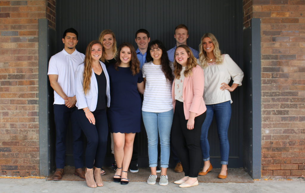
Meet the Pros is a 57-year-old advertising conference for college students and is presented by the American Advertising Federation Omaha (AAF Omaha). This year, our summer intern team, including yours truly (I’m the one in pink ^), was tasked with creating a theme, look, social media plan and website for the 2020 conference.
After we were briefed, all nine of us interns – Bertin, Emma, Amy, Sophie, Connor, Alex, myself and Kelsey (listed in order of appearance above) – spent quite a few hours together brainstorming possible themes for the conference. We threw out all kinds of ideas, ranging from the jungle to lightbulbs. We focused on what the visuals or title could be and what messaging we wanted to convey about Meet the Pros.
Something that gave us the leg up throughout this project was that we knew our audience very well. Afterall, our audience was us – students studying advertising, marketing, design, journalism and PR. So we asked ourselves, “What would we want to hear?”
But we also asked the big questions:
- What could this conference be?
- How could MTP increase attendance?
- Why wasn’t the entire Midwest participating?
As a copywriter, while we were sitting around and talking, my attention was on trying to come up with a possible title. I said something like, “I want people to know it isn’t hard to attend … (college students love convenience!) … it’s right in Omaha. It isn’t far away but it could take you far. Something like ‘You don’t have to go far to get far.’” And then I said, “Oh … that’s not bad.”
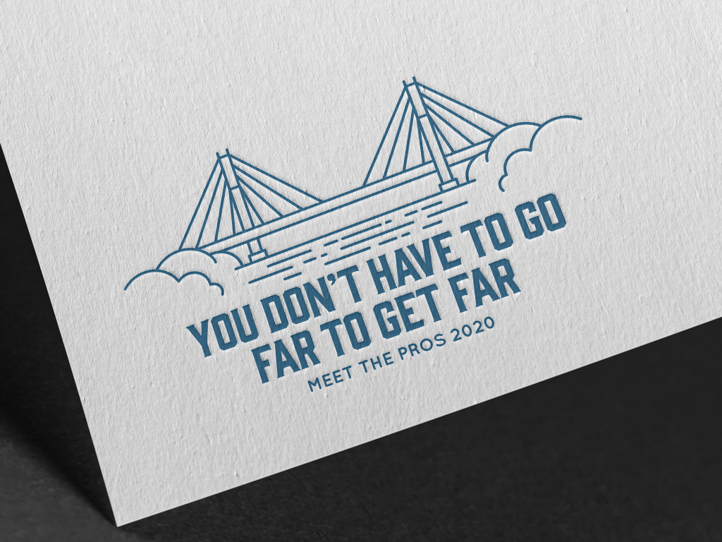
From there, we all brainstormed a possible visual to match the messaging. We looked at roadmaps, cityscapes, cars, backpacks and architecture iconic of the Midwest. We also looked at local trends – a popular one being monoline design. Sophie (social media) projected her laptop onto the wall, Pinteresting and Googling up a storm, to help create a mood board. Connor, the art director intern, took all the ideas and created the beautiful logo you see now, centered around the Bob Kerrey Pedestrian Bridge. He created a visual that was friendly and welcoming and would encourage college students to attend.

Once we were all on board and we had the creative director’s blessing, we were given the opportunity to present our concepts to the client. Emma (account service), Connor (design) and I presented two concepts on behalf of the intern team, recommending that the client choose option 2: “You don’t have to go far to get far.” The client agreed with our recommendation and Meet the Pros 2020 had an official theme.
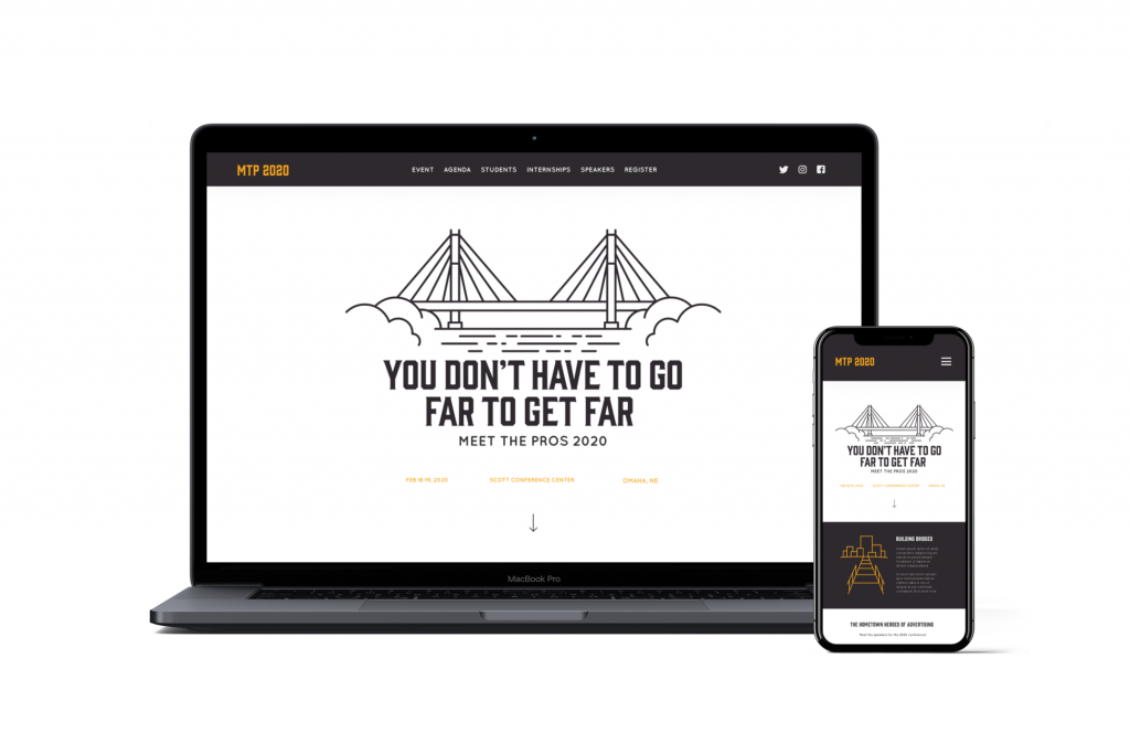
After finalizing the logo, the team got to work on the website. I wrote the copy – trying out a couple different tones until I found one that sounded youthful, engaging and confident. Meanwhile, Connor designed a sleek, professional and functional look for the website. Amy (digital) began editing the old website and implementing the new design elements. Amy also did some coding on the landing page of the website, which brought the logo to life – literally.

This project was an incredible learning opportunity, from start to finish. We were able to see a concept develop from being words jotted down on a page to the theme of an entire conference – and we got to make it happen as a team. This project made us think creatively and critically – skills we will need in the future. You don’t have to go far to get far, indeed.


