Fisher-Price launched a brand refresh effort in December of 2019. The work done by Pentagram, Wieden+Kennedy and Fisher-Price is a masterclass on brand expression. The coordination of different agencies, contrasted brand history, varied expressions across multiple touchpoints for multiple products, and a pitch-perfect execution like this doesn’t happen by accident. You would be forgiven if you thought that with money, size, and ubiquity, a brand refresh effort like this would be relatively common. Not easy, but certainly not a risky endeavor. Almost templated.
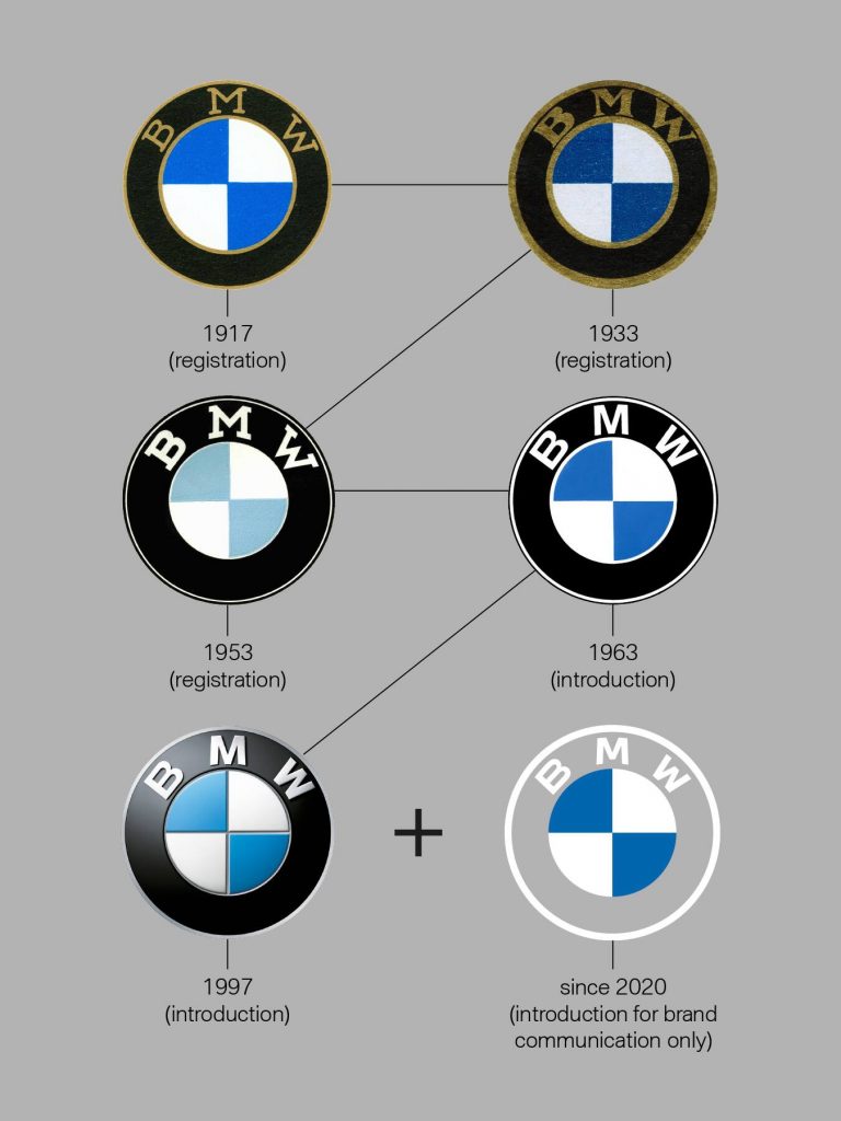
BMW just released a new logo and hinted at a brand refresh, too. They are focusing the bulk of their effort on their iconic logo and likely have suspended an adjacent campaign with the cancellation of the 2020 Geneva Motor Show. Unfortunately, BMW’s possibly truncated efforts offer a stark contrast to the impressive harmony Fisher-Price and their partners sang together.
Here’s a quote from Jens Thiemer, SVP of Customer & Brand, which was shared via a logo history page BMW developed to help explain their brand refresh:
“BMW becomes a relationship brand. The new communication logo radiates openness and clarity. With this new transparent variant, we want to invite our customers more than ever to become part of the BMW world. In addition, our new brand design is geared to the challenges and opportunities of Digitization [sic] for brands. With visual restraint and graphic We [sic] are equipping ourselves flexibly for the wide variety of contact points in communication at which BMW will show its presence online and offline in the future. The additional communication logo symbolizes the significance and relevance of the brand for mobility and driving pleasure in the future.”

To be clear, the logo refresh is arguably very good indeed. The execution of the logo update is a source of hot debate for backseat designers, but regardless here’s a thing brand managers and agencies say all the time at the top of their lungs, “Your logo is not your brand.” And this is true even for BMW. The history of their logo is rich and important and beautiful and deserves the level of intense scrutiny they and the world are giving it, but their logo is not a brochure. It is nigh impossible to tell the world you are now a relationship brand with a singular logo expression, and although Jens hints at larger more coordinated efforts, the rollout thus far has been singular and first impressions matter.
So, but, why would either of these brands refresh in the first place?
The Fisher-Price brand—like all consumer brands—needs to be relevant for their customers. Time favors the prepared. The Fisher-Price brand wasn’t wrong or broken—it may have just been old. We don’t have direct insight into what predicated this move, but it is a safe assumption that they wanted to adjust with Father Time. Insights from Pentagram’s site state that this brand refresh, “…takes the company back to its roots as a toymaker and looks at the role of toys and play in children’s lives today.”
BMW’s agenda is less clear, and that’s symbolic of the problem. Jens mentioned that BMW is becoming a relationship brand—which is to say they will be valuing the client/customer relationship with more fervor. This sort of move seems like a head-tilt when you consider the solid ubiquity of BMW in the world’s culture already, but it makes sense when you consider time. Recognizability is not the same thing as loyalty. Demographics change and if you do not change with them, you risk becoming recognizable and invisible at once. You know who Kleenex is, but are those the only tissues you insist on buying?
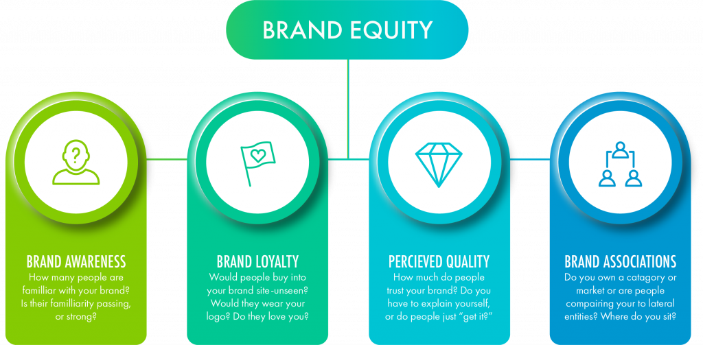
If you want to express your brand to the world there are four primary ways you can focus your efforts. You will likely want to dip your toes in each of these efforts, but knowing where to aim your efforts will greatly increase your chances of a bullseye. You can build brand awareness, brand loyalty, brand associations or you can build the perceived quality of your brand.

Like BMW, Fisher-Price’s brand has a ton of equity in awareness, you already know who they are. But do you know what they stand for against other toy manufacturers? Do you know why they stand out? The associations get more and more blurry as time has worn giant grooves in their look and feel. This negatively impacts brand loyalty and perceived quality in some pretty obvious ways. As competitor products begin to saturate the market the danger of a price war becomes unavoidable and no one single company in the toy market has been able to own innovation, or creativity, or emotional attachment, or, or, or … So they didn’t exactly rebrand themselves. It seems Fisher-Price decided that increasing brand loyalty meant increasing the emotional connection they want to make with customers and increasing their perceived value. They freshened up. They honed the edge of the blade with delicate moves that retain the recognizability of their graphic language (not JUST the logo) and turning up the volume on anything that speaks to their emotional point of “Let’s be kids.” Let’s have fun and play. Let’s let stress be someone else’s brand, we are just here for the belly laughs and fun. And they leaned hard into some specific insights. As Wieden+Kennedy puts it, “we re-introduced the brand by inviting grownups back to a place they might have forgotten…”
I am not saying that Fisher-Price’s strategy is perfect. Who could ever possibly say that? Sometimes, who you are is only as clear as who you are trying to be. It would be wonderful to be able to travel two years into the future and see if BMW’s strategy crystalizes and gets traction. Fisher-Price is out of the gate with Olympic level synchronicity, but there is no perfect brand expression. It’s a journey, not a destination.


