So, you think you want to rebrand. After all, companies rebrand all the time, right?
Maybe you feel like you’ve lost touch with your customer base. Or maybe you want to expand market share. Maybe your brand isn’t capturing and representing your core values as much as you would like. Or maybe your company needs to make a clean break with a troubled past and introduce itself anew to the marketplace.
But do you know how much of a change you’ll need to make to your brand? Rebranding carries risks as well as rewards, and it’s important to create your rebranding strategy around your actual business problems.
What’s in a brand?
Before we discuss the types of changes you can make to your brand, let’s first define what your brand is. Your brand is the sum of everything that’s out there representing your company—your vision, your mission, your values, your visual language including your brand identity, imagery and iconography, as well as your tone of voice and messaging. To change any one of them, a combination of them or all of them will mean a rebrand and a change to your brand perception. Since rebranding also implicates the goodwill that your company has built in the marketplace, a rushed and poorly thought-through change can cause real damage to your image.
Why do you want to rebrand?
Before you do anything to your brand, assess the situation. What is the business problem you’re trying to solve? Is rebranding the only answer or can market research and a new marketing strategy help instead? Having a clear purpose and strategy for the rebrand will make it feel like an authentic and natural progression for your company. Having the right experts by your side can be very helpful in planning and executing your rebranding strategy.
Evolution vs. Revolution?
If you are a well-established brand in the market with good brand equity, you’ll probably want a more conservative evolution of your brand. This will mean keeping the foundation and refreshing only aspects of it to meet the demands of the times.
If your brand has less recognition in your desired market, your company has just gone through a merger, or if you need a fresh start whether due to negative publicity or a fundamental shift in core believes, a more dramatic revolutionary overhaul may make sense.
In either case, a detailed audit of your existing brand assets can guide the strategic approach to your next steps in your rebrand adventure.
Evolving your brand
If you decide to evolve and refresh your brand, there are a number of strategies to consider that will help preserve the brand equity you already have in the marketplace. Among the most common evolutionary strategies are brand identity simplification and name modification.
Evolution: Identity Simplification
In reality, very few companies manage to create a simple and clear logo from the very beginning of their business. Eager to communicate everything they do, the identity marks can get fairly overcrowded with elements and information. Add to that different trends in fonts and colors, as well as new channels for communication and you can get yourself an outdated logo within a couple of years.
That’s when, small nuanced changes to your visual identity, like changing the fonts, colors or shapes/icons within your logomark, are often enough to convey a refreshed look to your audience, while keeping the core recognizable elements within your already-established brand.
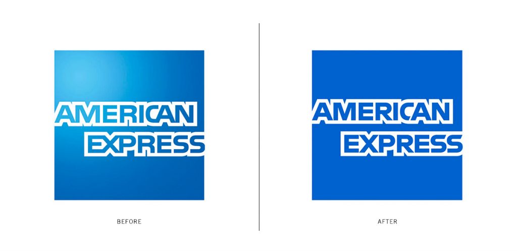
Let’s take as an example the brand refresh Pentagram did for American Express. According to the agency, one of the primary goals was to “reinvigorate the brand identity and optimize its performance across various platforms and bring visual continuity across geographies and business channels.”
At first glance, the new American Express logo looks just like the old one. Same square box, in blue color and similar type treatment. But that’s what a subtle nuanced change looks like. It preserves the built-in brand equity within the existing mark while applying slight tweaks to improve its performance in the new times. Keeping the iconic blue box pays homage to the heritage of American Express and its 168 years of brand equity and iconography. However, removing the blue gradient within the box and redrawing the classic lettering improves the legibility and scalability of the mark and helps optimize its performance throughout multiple channels.
In addition, an alternate abbreviated version of the logo was created to ensure further recognition and legibility with the small digital space in mind.
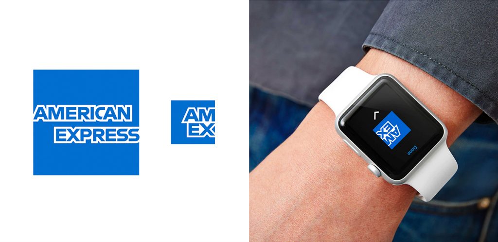
Your brand identity needs to be scalable and responsive, and just like your responsive website changes in size and layout when viewed on different devices, your logo needs to be flexible enough to go up and down in size to cover the wide range of applications from a large-scale outdoor billboard to a tiny profile icon on social media.
Evolution: Name Modification
As companies achieve success in their initial market, it is quite common for them to consider expansions into new product lines and new market spaces. As a natural next step, a lot of them consider updating their brand name as part of an overall brand strategy.
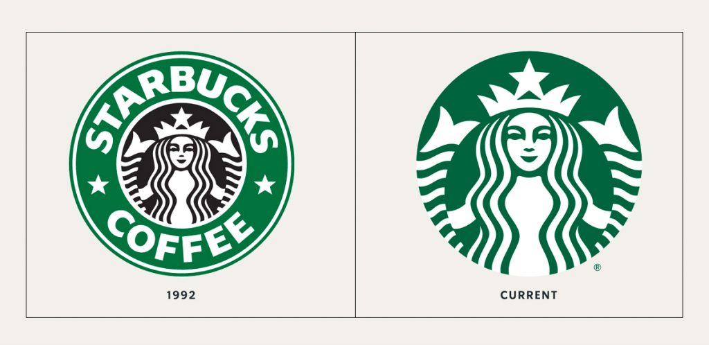
Both Starbucks Coffee and Dunkin Donuts just did this. Starbucks removed the word “coffee” from its name and separated its wordmark Starbucks from its “Siren” logomark in order to expand beyond the coffee brand and allow more flexibility in the use of the logo in different marketing channels. As part of its logo update, in its brand expression, Starbucks says “As we evolve to meet beautifully diverse customers all over the world, our brand has evolved too. Here we introduce a fresh new design system that maintains the core elements of our brand while keeping our customers’ experience central to creative expression.”
Similarly, Dunkin’ Donuts dropped the word “donuts” from its name as part of an effort to capture a larger share of the beverage market, which already “accounts for about 60 percent of its business” (Source). In a press release, Dunkin’ said: “The new branding conveys the company’s focus on serving great coffee fast, while embracing Dunkin’s heritage by retaining its familiar pink and orange colors and iconic font, introduced in 1973.”
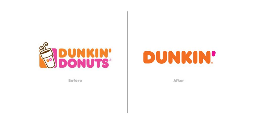
Both companies managed to retain the goodwill with their existing customers by keeping the majority of their visual elements from their existing brands, including color palettes, fonts and logomark treatment.
And for more brand refresh examples, check out one of our previous posts here.
Revolutionizing your brand
Now let’s talk about bigger, more drastic departures for your brand that can usually end with a new brand identity but also a new vision, mission statement and values. A brand revolution is more often needed when your company has experienced a major shift, whether that’s achieved through a merger, some kind of a PR crisis or simply deciding that your organization needs to pursue a new direction to gain new customers or recommit to existing ones. To cover all of these might require a separate article, so we’ll touch quickly on the former and give examples for the latter.
Revolution: Merger
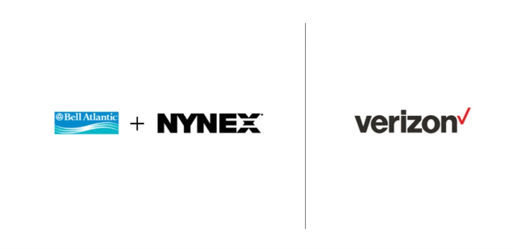
If your company is going through a merger, the first steps will be to audit carefully both brands and evaluate which one has bigger and stronger equity and recognition within the market. All in all, you have four options:
1. Keep both brands.
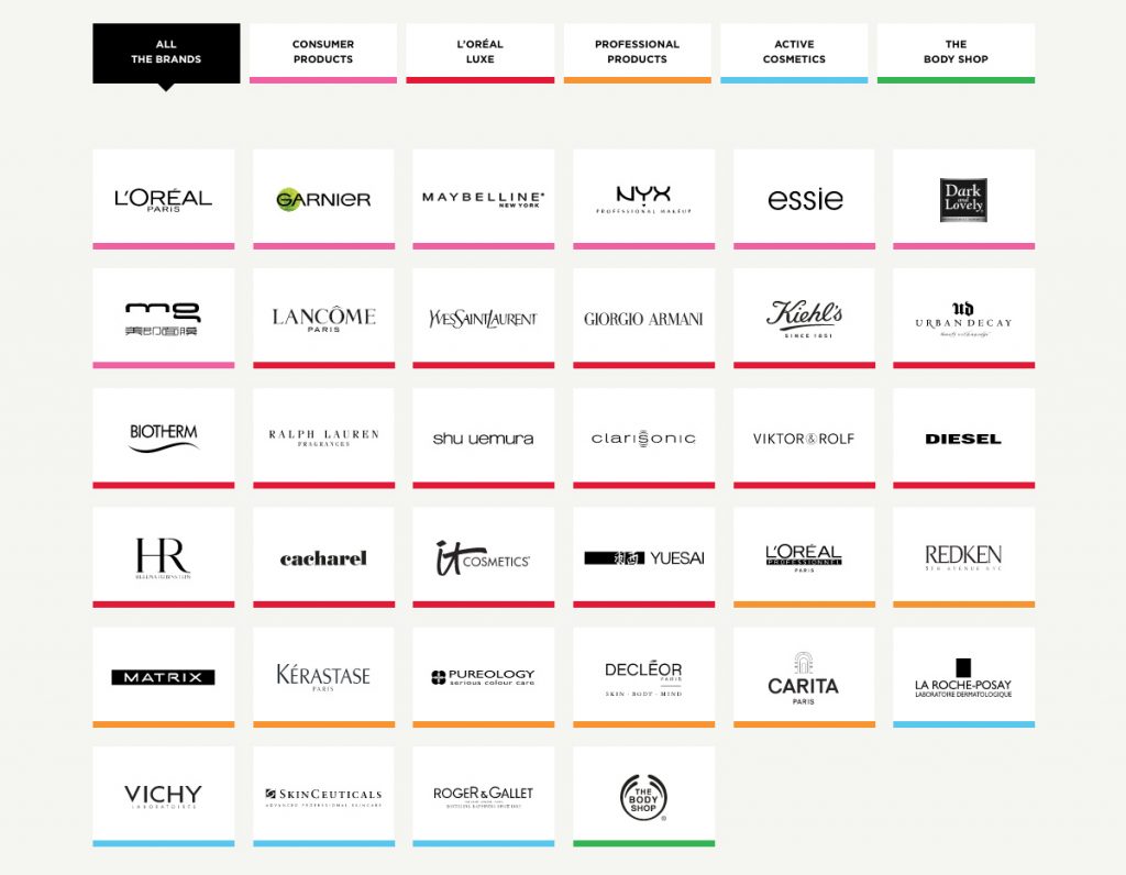
If both brands are strong and serve different markets or offer different products, you might want to keep them both the same and not change them. L’Oreal is a good example here as the umbrella brand, every time they acquire a new brand product, they add it to the family and keep its existing look.
2. Combine both brands.
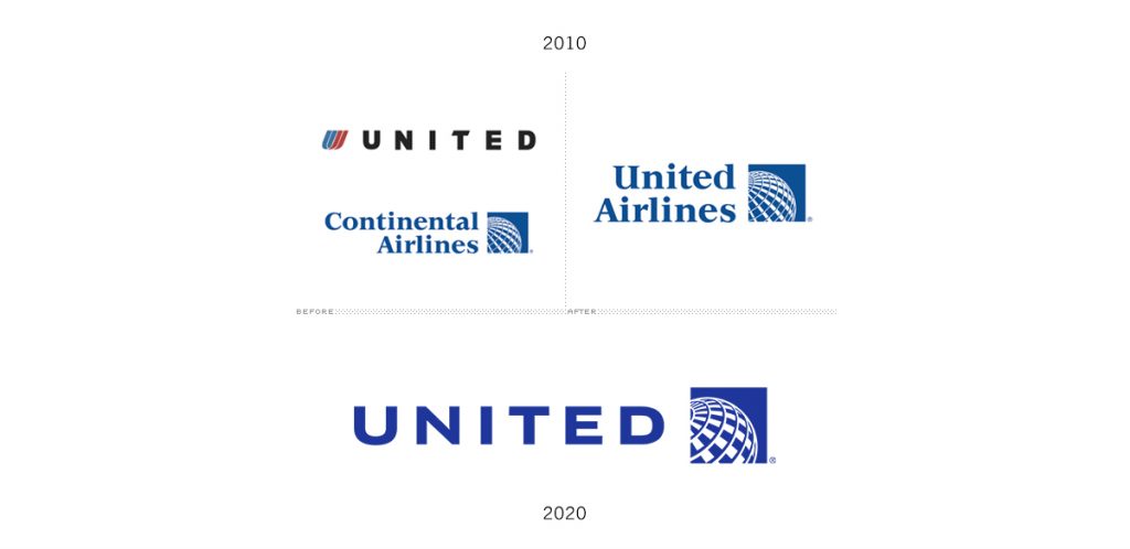
If both are strong and overlap in market audience, you can consider merging the name or mark and including both names to unite them under a common vision and mission. When United and Continental Airlines merged, they picked elements from both logos and merged them together.
3. Pick one. Go with the more recognizable one.
If one of them is definitely bigger and more recognizable (and usually acquiring the other) you can have them eventually replace the one they acquired. According to a statement by TD Ameritrade, “Schwab has a proud history, a respected brand, and a strong corporate culture. As the acquirer, we expect those things to remain post-integration. The combined company will carry the Schwab name.”
4. Create a new brand.
This is the most drastic one – when you’d start from scratch and create a new identity for the two companies to represent the new entity.
Revolution: PR Nightmare
There are a lot of different ways to handle a PR nightmare depending on your situation. But first of all, you have to look at your mission, vision and values. Recommit to your audience and send the right message to authentically gain their trust back before changing anything about your visual look. In any regard, focus on repairing the relationship with your customers first so that you don’t further alienate them. For more on this topic, check out this Forbes article featuring 10 of their experts on PR crisis management.
Revolution: New Direction
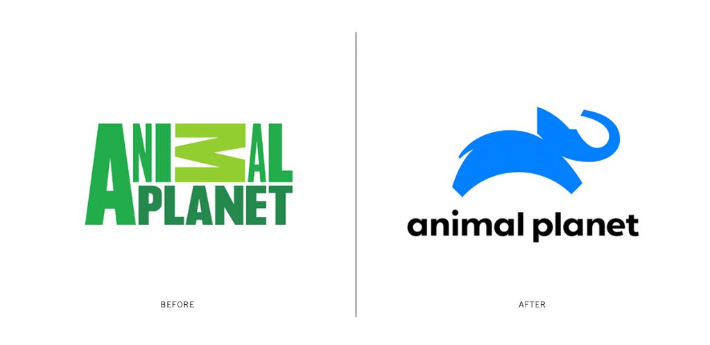
This option is for you if you feel like your company has been drifting apart and its current mission has become irrelevant to its audience. Animal Planet currently went through a complete brand makeover, not only in its visual identity but also in its mission and programming.
As Susanna Dinnage, Animal Planet’s first-ever Global President states in an IBC article, “It is not a tweak, it is a big statement … The brand is new; the mission is new.” She adds “We have had to reimagine Animal Planet for new audiences in a new time.” In addition, the channel has a new mission statement too: “To keep the childhood joy and wonder of animals alive by bringing people up close in every way.” As part of the rebrand, new titles will be added to the channel that can be easily translated across digital platforms and consumer products, as well as app content.
The new logo features a playful blue elephant, representing the entire animal kingdom, leaping across the invisible globe above the channel’s name.
But new directions don’t always work out, especially when taken purely for the sake of chasing new cultural trends and not having the customer in mind. Let’s take Weight Watchers as a cautionary example. They renamed themselves to WW in the effort to acquire new market share and evolve from a primarily diet-oriented brand (which nowadays can have a negative connotation) to more of a lifestyle, wellness-focused company.

Strategically, the shift made sense, but the execution was done poorly. The new look was visually unrecognizable by their current customers and was almost launched overnight without generating any awareness for the change coming. As one Forbes article says, “The advertising was confusing, cramming too many scattered claims into the ads. The brand’s messaging couldn’t make up its mind between weight loss, fitness and young beautiful bodies, while the somewhat generic tagline announced the new territory of Wellness.” To add insult to injury, they had picked actress Kate Hudson as their new spokesperson, which seems like a complete departure from their previous choices of real people who have actually gone through the weight loss program like Oprah and Jennifer Hudson. They not only managed to alienate existing customers but also came off as completely tone-deaf in the era of body positivity.
What’s the moral of the story?
Yes, companies rebrand all of the time. But a successful rebrand starts with careful consideration of the business problems and business goals of your company. A company with a strong brand, good equity in the community, and positive momentum in the market may benefit from a relatively conservative refresh or update of their brand assets. A company with weak recognition or whose values have fallen out of sync with the market it serves may wish to consider more radical changes to its corporate brand. The key is always to plan your changes with your corporate values and the desires of your audience foremost in your mind. Arm yourself with knowledge and good marketing partners to help you create a solid strategic plan and navigate through the ever-changing advertising waters.


