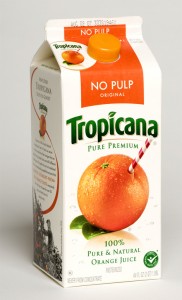
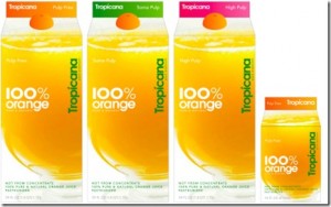
As we were sitting over Sunday morning coffee and checking out the latest and greatest deals, we ran across a coupon for Tropicana Orange juice.
Instead of the cool twist on a classic packaging with the image of red striped straw in the orange, the brand had done a major belly flop by “genericizing” it’s brand into something that you would see on the Kmart shelves circa 1990. I liked the old packaging. It worked. (I mean, who wouldn’t want the freshest tasting oj – and the fact that the brand portrayed it as tasting as fresh as if you stuck a straw in an orange…YES!) And if you are going to refresh the brand, I can understand that…but why move so far away from the things that worked on the old packaging and brand?
What on earth were they thinking? Number one, it is one of the more pricey brands of OJ on the shelf and the older “look” really held its own in that price point. This revision to the brand makes it look like it should be in the “dollar aisle” along with the 99 cent no name boxes of cereal and ‘faux’ hamburger helper. oh…and def check out the “mini orange” screw top. Nice place to spend the money guys…no one will notice something like that especially when the rest of the packaging really falls this short. It would be different if they decided to charge 89 cents per container, but the fact is, they are still charging a premium for a brand that now looks generic.
What is going on with Pepsi products these days and their really odd choices in re-branding??
I am so disgruntled and confused.
http://www.underconsideration.com/brandnew/archives/pepsi_takes_the_tropic_out_of.php


