Okay, I’ll bite.
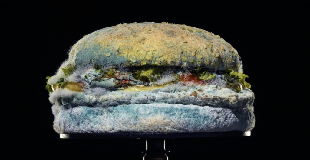
Burger King released its The Moldy Whopper ad campaign yesterday and it has a lot of marketers and consumers talking. Why? Because it’s gross and brilliant all at the same time.
How much do I love this commercial?
Let me count the ways.
1. It’s a true F-U to McDonald’s. Hands down, this is the absolute BEST attempt I’ve ever seen on Burger King’s part to compete directly with McDonald’s. I’m sure you’ve all seen the images circulating throughout the internet that depict McDonald’s most iconic menu items having been set out for a month and yet they look pretty much the exact same. All because of preservatives. It’s quite shocking when you really think about it. So kudos for Burger King for having the cojones to make us think about it. And for taking the creative advice of their advertising agencies. It has paid off in publicity already, and I’m sure it will pay off in sales soon enough.
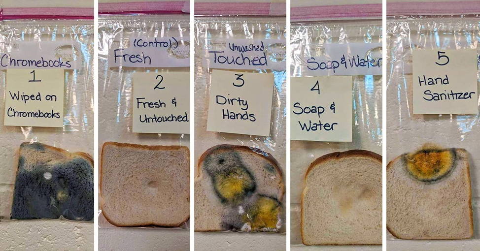
2. It’s timely. I can’t help but see this spot and be reminded of the bread experiment a teacher recently did to show the importance of handwashing. To see the way germs affected the bread was shocking but fascinating. It’s the magical world of science, and that’s something this campaign has going for it, too.

3. It’s beautiful. You can’t deny that this is just stunning to watch. Like many pieces of art, it has taken something seemingly disgusting – mold, obviously – and made it so absolutely beautiful. The simplicity and care behind the spot does not go unnoticed by me, and hopefully not by others either.
4. It’s mesmerizing. You can’t tell me you’ve never had your attention caught on by a looping video of water moving, sand being poured, paint being mixed or whatever the heck else just seems to suck you right in and keep you there for what feels like hours on end. These videos and GIFs are oh so satisfying. And this use of time-lapse by Burger King has that same powerful, attention-grabbing tool, and they used it quite well.
5. The music is spot on. In this writer’s opinion, when you can pick a song that does the heavy lifting for you (rather than writing :30 of voice over copy), it’s actually a big win. And I can’t imagine a better selection for this spot.
6. The copy is simple and perfect. I am always complimentary of a writer who can create one line – six words – that sums up the entire spot. “The beauty of no artificial preservatives.” Nailed it. It’s direct, yet ambiguously playing on the “beauty” of this spot. Again, like the music itself, it must carry a lot of the weight and really bring home the :30 commercial. And it does just that.
I could really go on and on, but I’ll leave it at that.
And now that I’ve shared my gut reaction to this campaign, my curiosity cap is officially on. I would love to know what you thought of it. What did you like about it? Was it more off-putting to you than clever? Would you still choose McDonald’s over Burger King? Leave your thoughts in the comments.
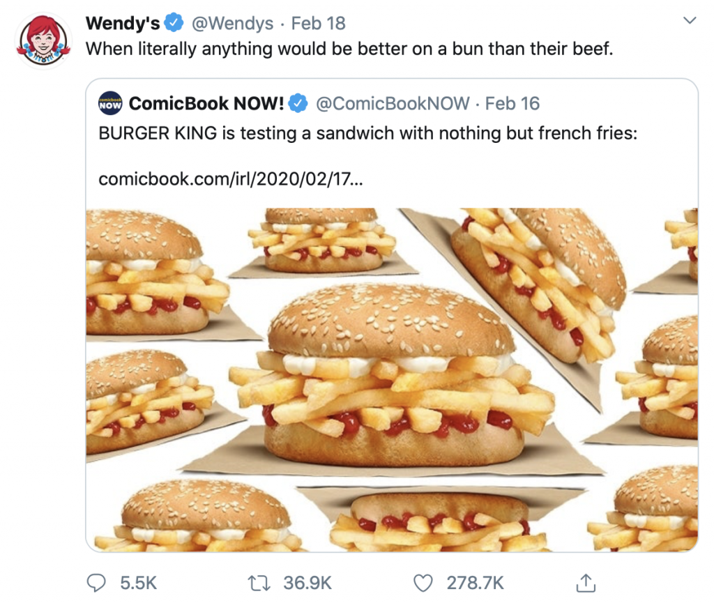
… Also … Did anyone see Wendy’s Tweet two days ago dogging on Burger King? Sorry, Wendy’s. While you made me laugh, they sure inadvertently responded to that one with this campaign. #touche


