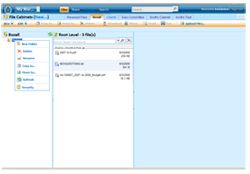
While getting briefed by the developers of a new document management tool, we could tell that the Saas (Software as a service) product was robust, but not necessarily intuitive. This raised a red flag, because our target audience research indicated that people would subscribe only if they thought the tool was very simple to use. It became clear that the most important thing to do was simplify the user interface to create a stronger initial user experience.
So that’s exactly what we did.

Before

After
The original interface was unapproachable. Its blue shades were cold. Its small fonts were daunting. By using a fresh color palette, larger fonts and numerous easy-to-understand icons, we eliminated the intimidation factor and created a friendly first impression for the intended user – small business owners.
 We also improved user experience by helping our client leverage the most recent development techniques. The new DocLanding has the feel of a desktop-based application, while existing as an online service. Unlike some web services that require constant page reloads to present new information based on user interaction, DocLanding keeps the user’s default file structure in the screen at all times. Additional features such as file previews and prompt boxes user a clean overlay technique that brings attention to the functionality while not being obtrusive to the user.


