A Site Inspired by Leadership and Innovation
National LINC is a premier annual conference hosted by Omaha-based TD Ameritrade Institutional (TDAI) that welcomes current and prospective Registered Investment Advisors (RIAs) to meet, listen and learn from others in the industry. As a major custodian of these RIAs, TDAI needed a website refresh that matched the vibrant, innovative and inspirational tone this event embodies.
Insights
TDA’s brand represents strength and purpose, as well as approachability and trustworthiness. It was our job to carry that through to the LINC event’s brand. The pillars of LINC are found right inside its name (learn, inspire, network, collaborate), so these were guiding principles for our work, as well.
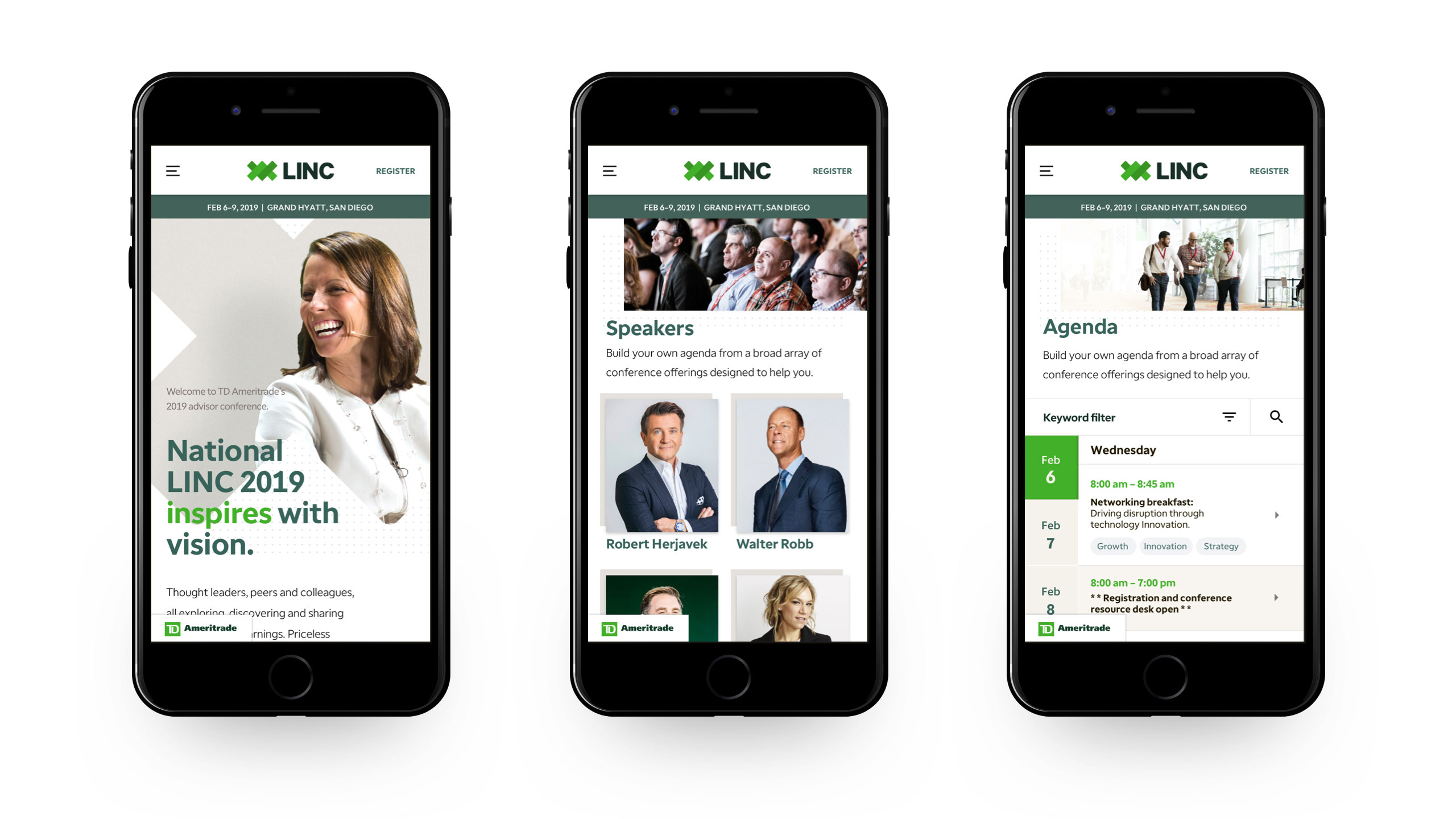
A large portion of TDAI’s RIA roster attends National LINC each year, and the tdaconferences.com website is the main hub for all the details an attendee needs to have the best experience at the conference. This meant the site needed to be clear and concise, visually and functionally appealing, and mobile-optimized for those looking up the agenda on the go between sessions. And TDAI also needed to offer up the most sophisticated and insightful resources, such as proprietary tools and software or an engaging networking and learning experience.
Execution
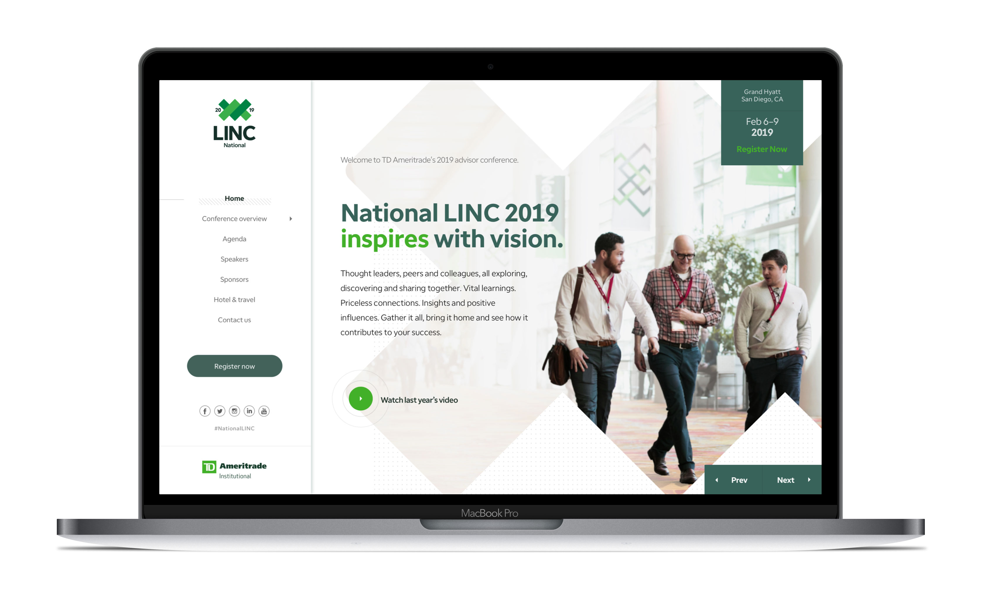
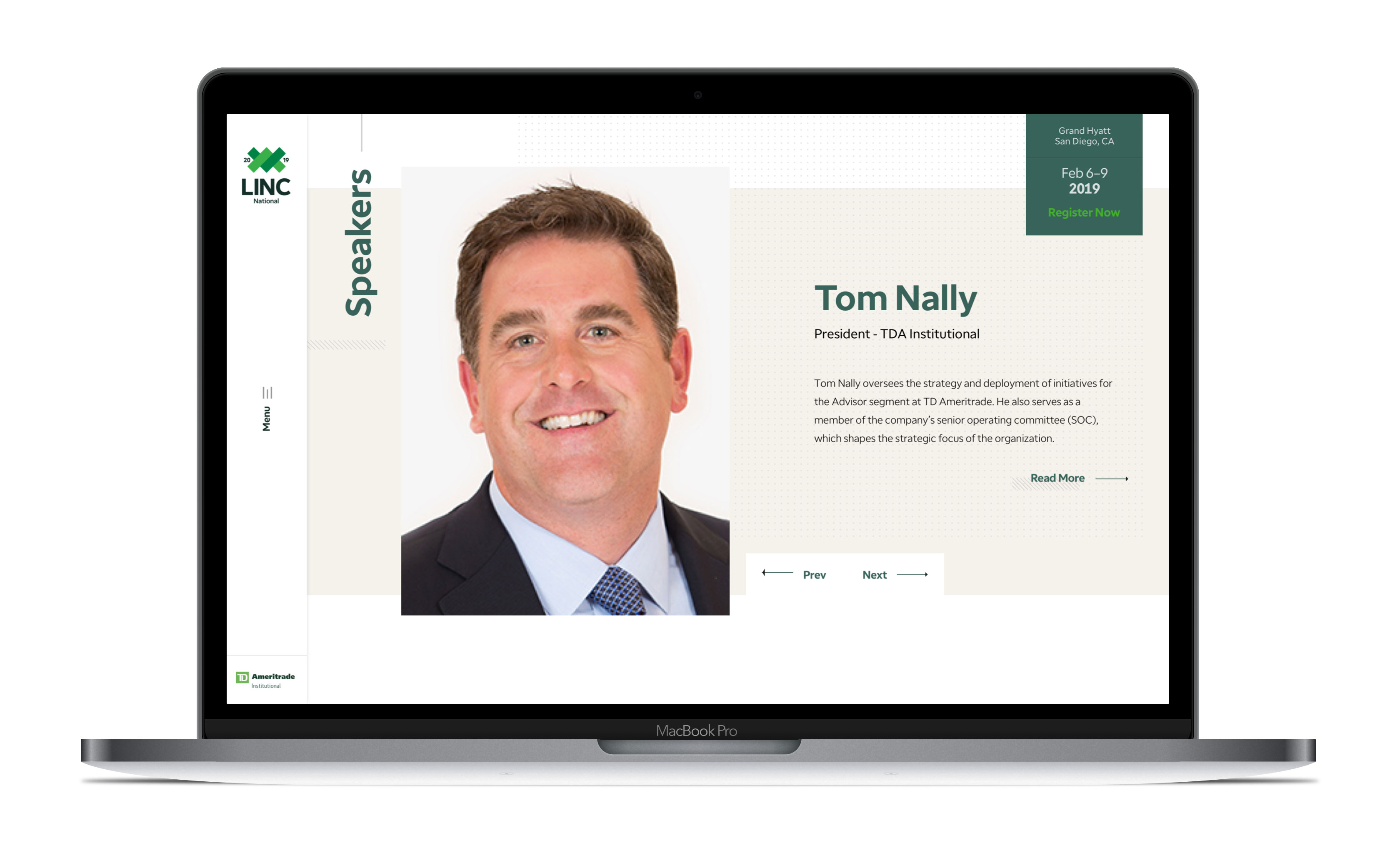
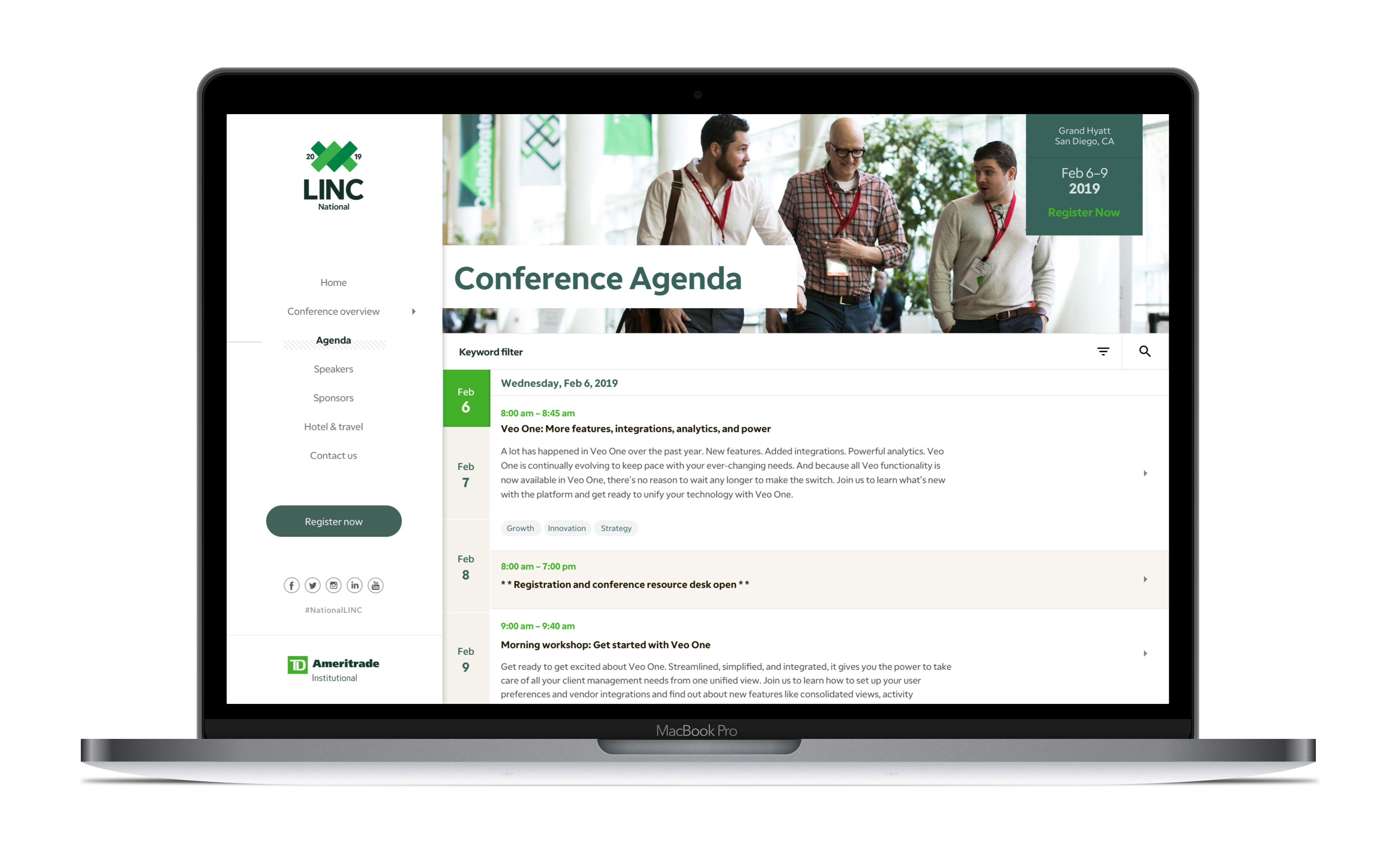
We led with a digital-first approach, as a way to introduce the new brand to our end users (RIAs and more specifically conference attendees) delicately and yet boldly with a brand-new interface and enhanced usability and responsiveness. What better way to set the tone of innovation and tech-savviness than by reinventing the main conference website? TDAconferences.com boasts a sleek design with easily digestible bursts of content, and more importantly – all of it is mobile-optimized for the first time.
Once we established the brand in the webspace, we worked with other TDAI vendors to bring the concept to life by expanding that look and feel out to conference collateral. The new LINC look was everywhere, from environmental branding such as wayfinding and architectural designs to stage set design and animated illustrations. If, by chance, we hadn’t caught their attention with the new website, they were sure not to miss it at the events.
Results
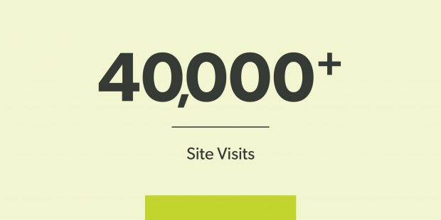
In the two months leading up to the conference, 26,000 users (around 40% on a mobile device or tablet) visited the site more than 40,000 times, giving our target audience a great introduction to the new look and feel.
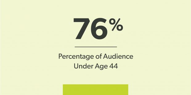
76% of the site visitors are under the age of 44, supporting our insight that the RIA demographic is getting younger.
The brand was so well-received that we’ve expanded the LINC brand into a more robust portfolio of educational and interactive events. This fresh and modern look will now be visible for several other summits and workshops. Each event type within the LINC portfolio will have – or has had – its logo, website and conference materials rebranded to LINC.
