Looks Aren’t Everything. But They Help.
It’s about more than just a pretty package. It’s about effective communication. Connecting with your audience is key. Every experience your consumer has should be on message, memorable and impactful. But that doesn’t mean it can’t look good, too.
First National Bank – Philosophy Brochure
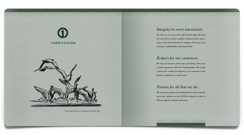
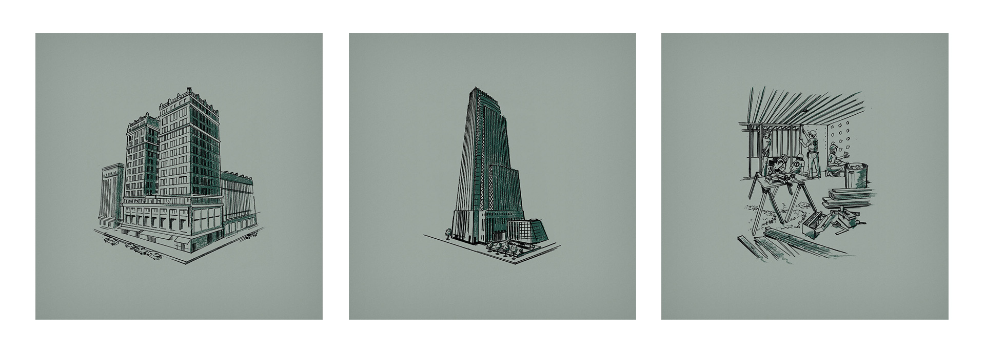
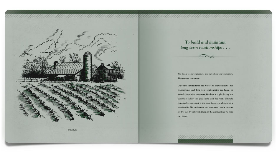
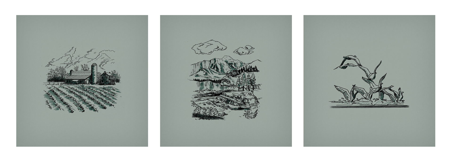
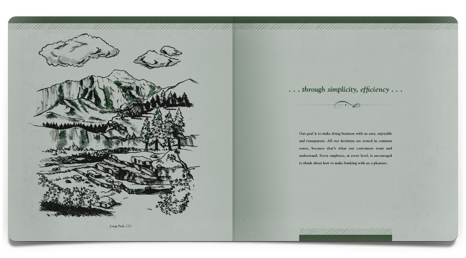
First National Bank has a history of doing what’s right for its customers and the communities in which they serve. This booklet communicates to the customer the mission and core values that First National lives by, and it defines the philosophy that customers can expect long into the future. To that end, we commissioned an artist to render several drawings that visually speak to our steadfast and strong history – our first building, an early print advertisement, and even current moments interacting with customers.
The Nifty Gifty Finder
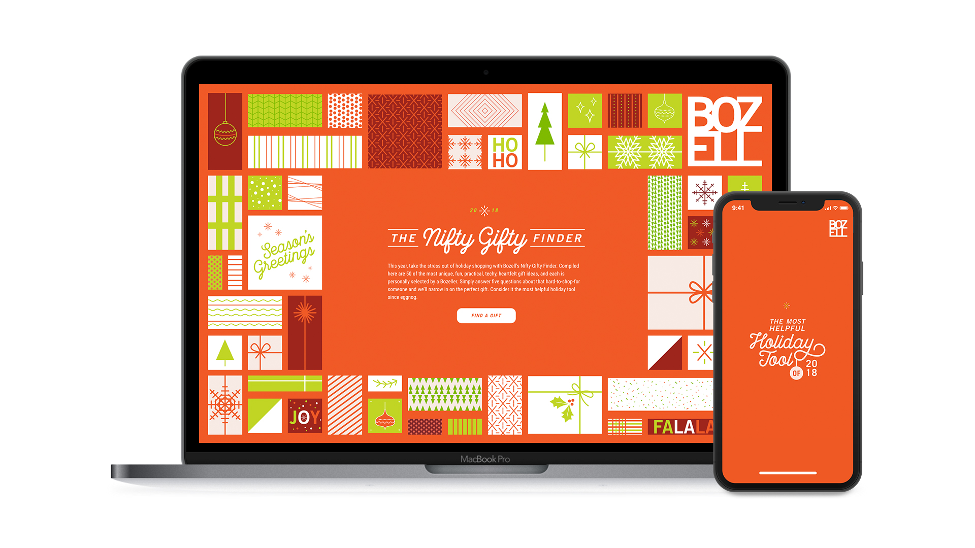
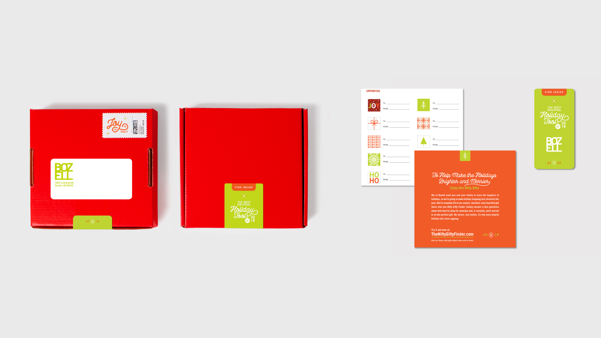
In lieu of a traditional holiday card, the Bozell team worked together to create TheNiftyGiftyFinder.com—an online generator that used five simple questions to help people narrow in on the perfect gift for those hard-to-shop-for someones. The site housed 50 unique gift ideas – some heartfelt, some amusing, but each one specifically selected by a Bozell employee. The site itself was animated throughout the entire gift-elimination process, making it a fun (and helpful) experience from start to finish.
Storz Brewery – Bottle Caps Poster
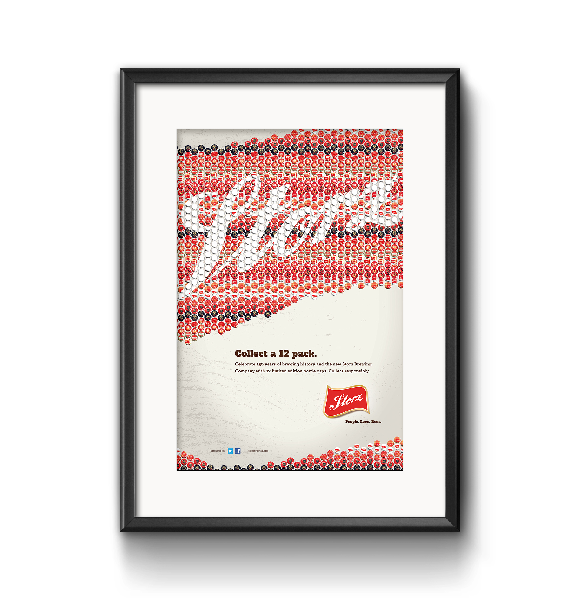
Because of the rich history, as part of the relaunch of the Storz brand, the public was invited to participate. Twelve limited-edition bottle caps were designed and submitted by the public, then chosen to be produced. By using the bottle cap designs to spell Storz, this poster not only revealed the public’s winning designs, but also became a collectible and fun piece of art.
Late Nights at the Zoo Poster
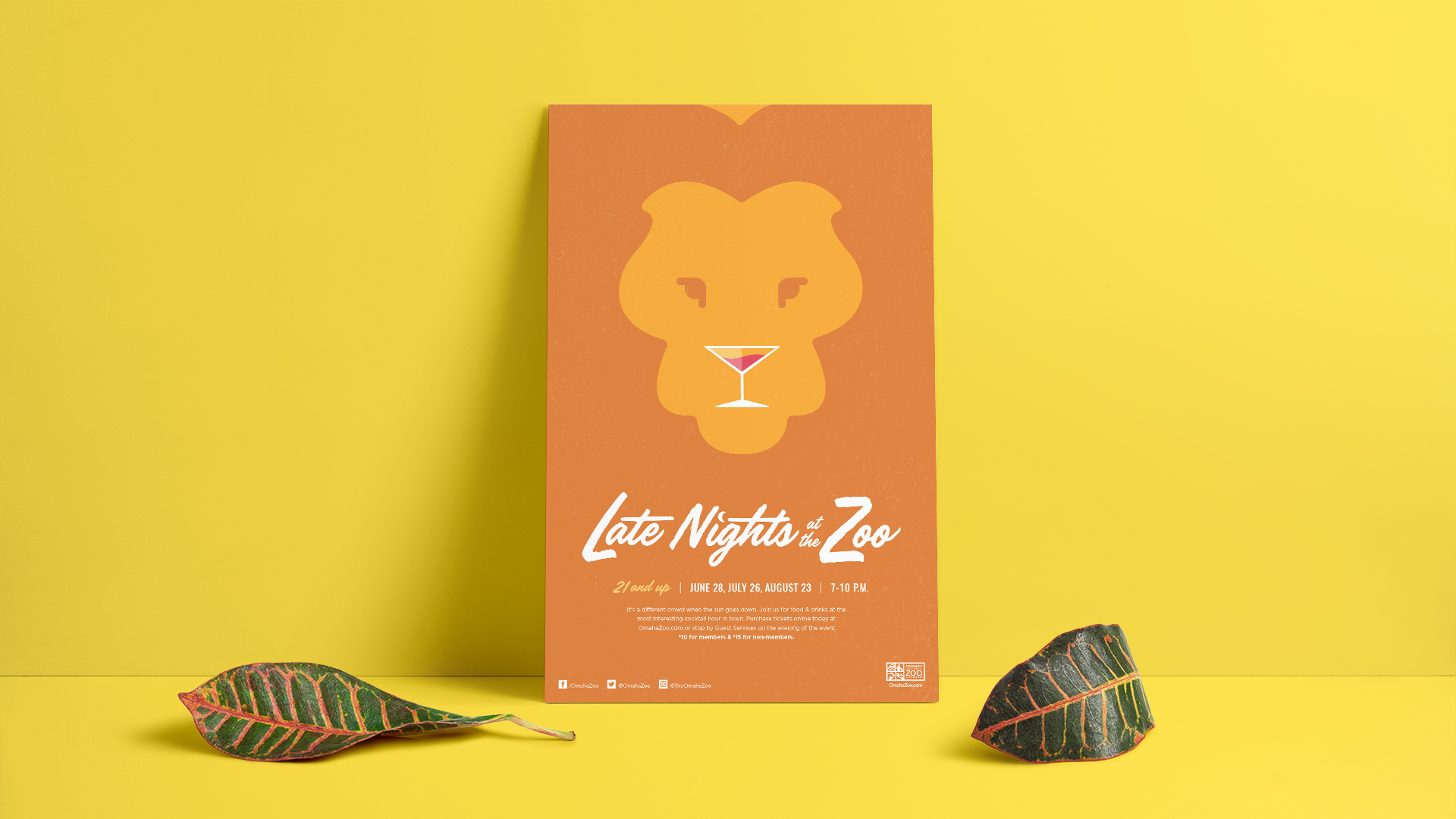
Omaha’s Henry Doorly Zoo & Aquarium is a known destination for families with children. To appeal to a different audience, they hosted Late Nights at the Zoo—a 21-and-over event encouraging adults to come explore the Zoo with a drink in hand. To help promote it, we designed a poster that discreetly blended the king of the jungle and a martini glass, creating a simple yet appealing optical illusion.
Re•Purpose Identity
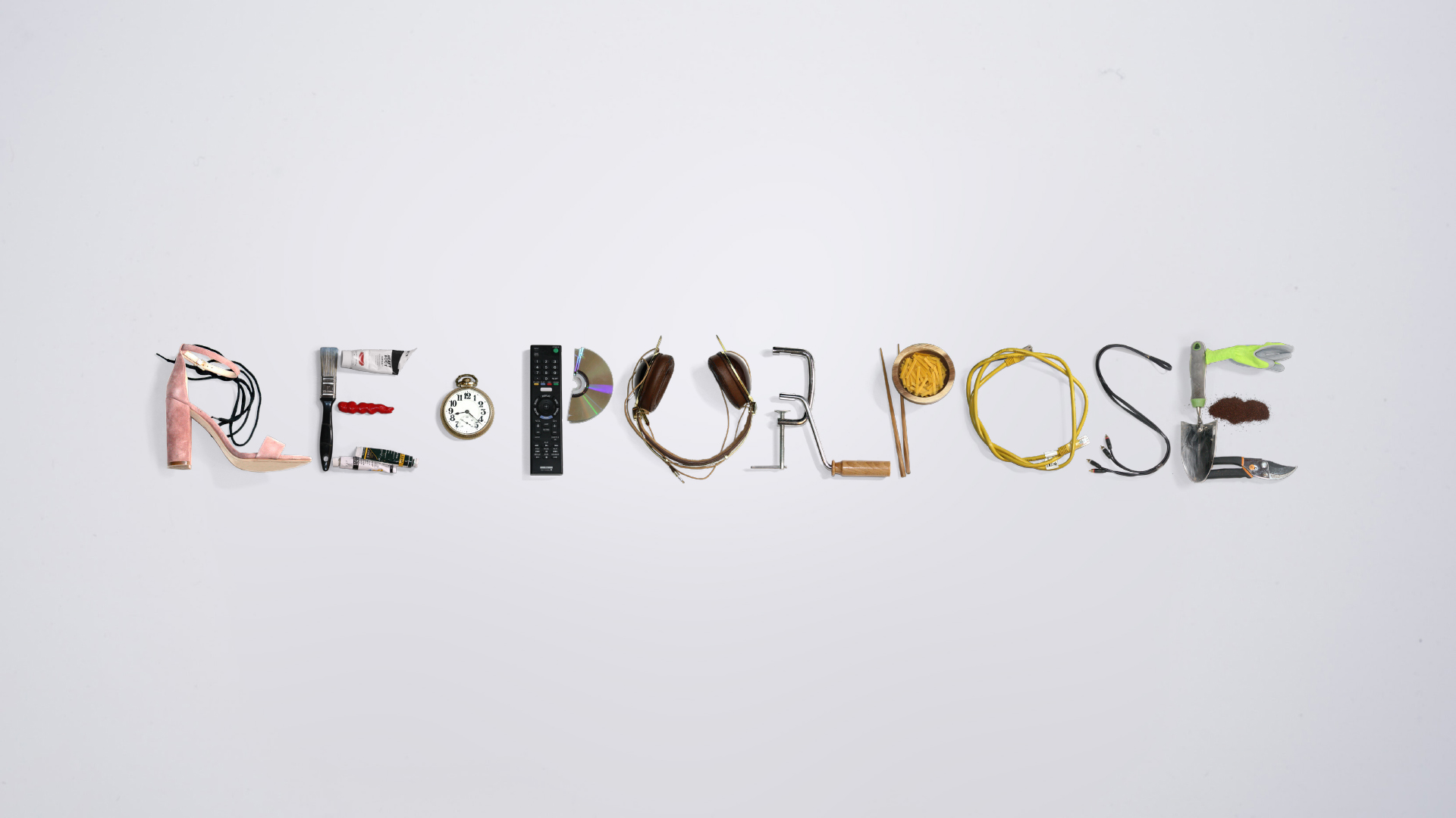
The Kaneko was founded in 1998 by international artist Jun Kaneko and his wife Ree with a goal of celebrating creativity through four main programming themes: design, ideas, performance and innovation. To help us brand their latest exhibit, Re•Purpose, the Kaneko turned to us. The exhibit was set to feature a collection of work from multiple artists that inspired purposeful introspection and conscious reinvention. Every piece featured in the show would incorporate recycled or otherwise reinvented materials, showcasing artists and partners who strive to make Omaha a more unified and sustainable city. For the exhibit’s identity, we were inspired by the meaning behind the collection of work: repurposing things that already exist. So, we scoured our office and our homes to find materials that could not only take the shape of the letters that spell the exhibit’s name, but also reflected the kinds of materials used to create the artwork that was part of the show. We used this logo as a foundation for supporting materials, including a poster which recreated the Kaneko logo with a similar aesthetic, and an accompanying booklet that would be given to exhibit visitors.
Omaha Performing Arts – 90th Anniversary Invitation
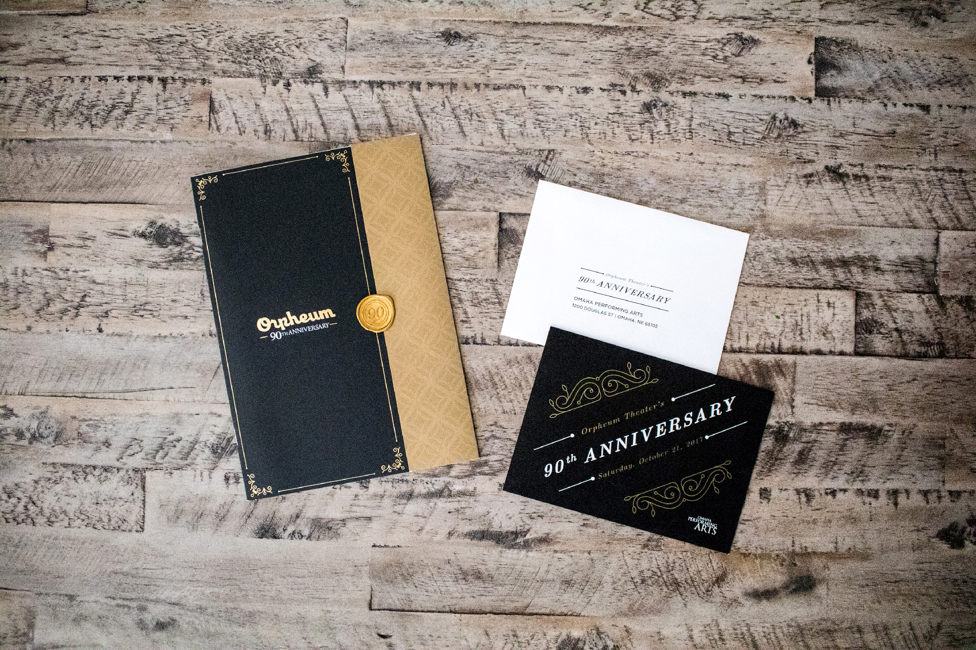
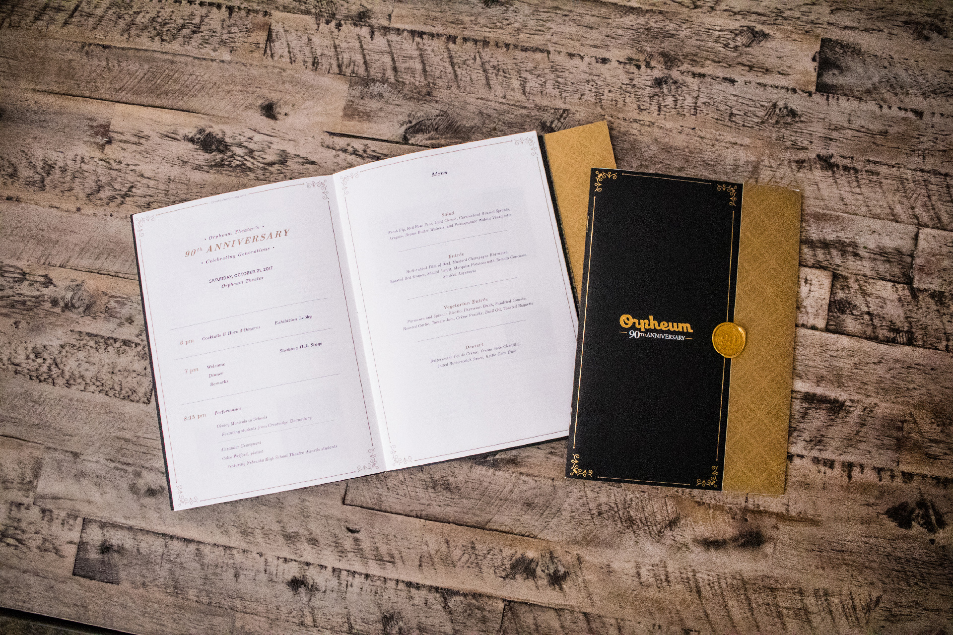
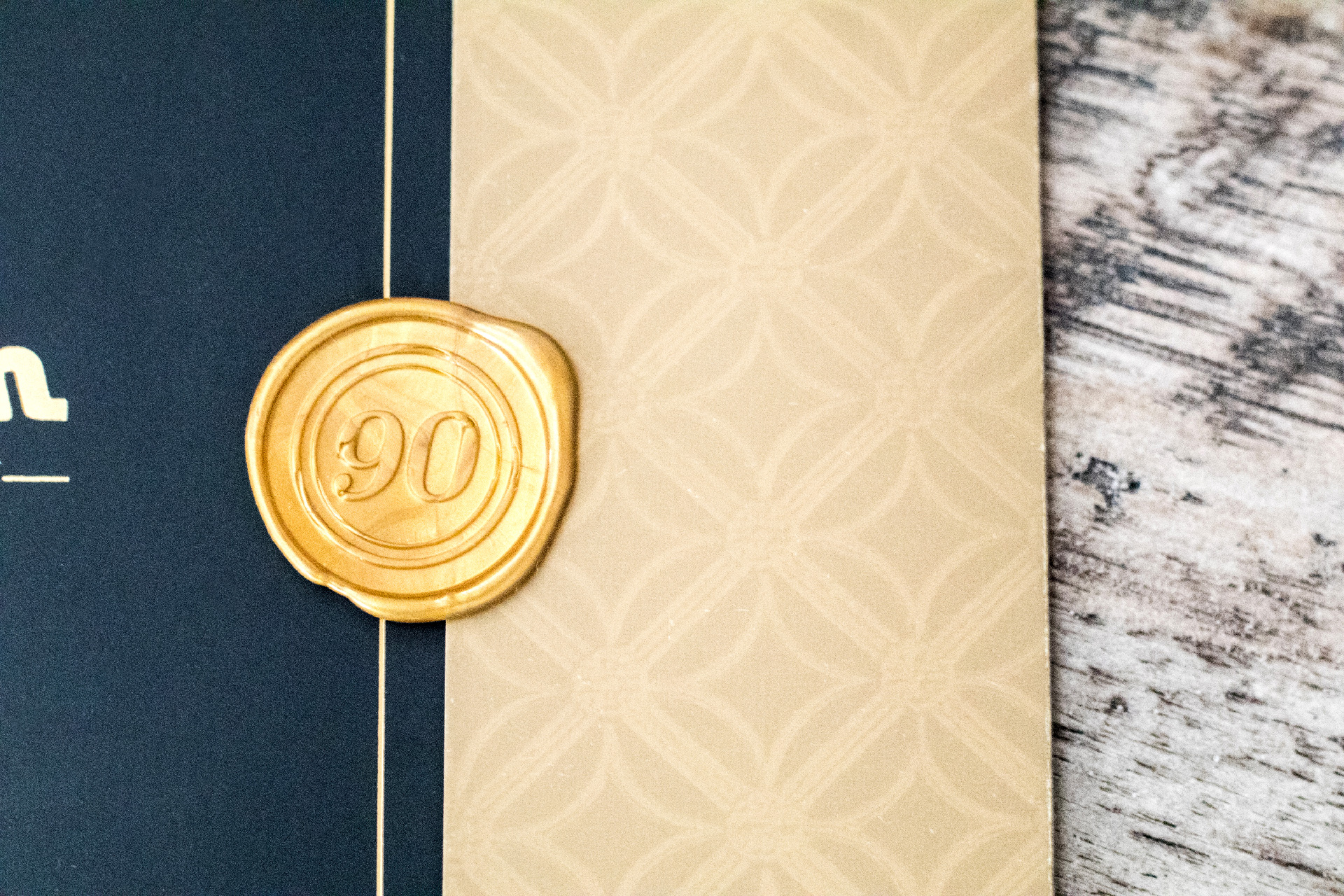
To celebrate the 90th anniversary of the Orpheum Theater, the Omaha Performing Arts hosted an exclusive gala. The Orpheum is a cornerstone of Omaha’s cultural history because of countless volunteers, donors and partners, and this event served as a thank you to all of its supporters. Inspired by the 1920s – when the Orpheum was built – these invitations used patterns pulled directly from the building’s architecture, while the use of black and gold communicated the elegance and sophistication of the event.
Love’s Jazz & Arts Center – Identity and Branding
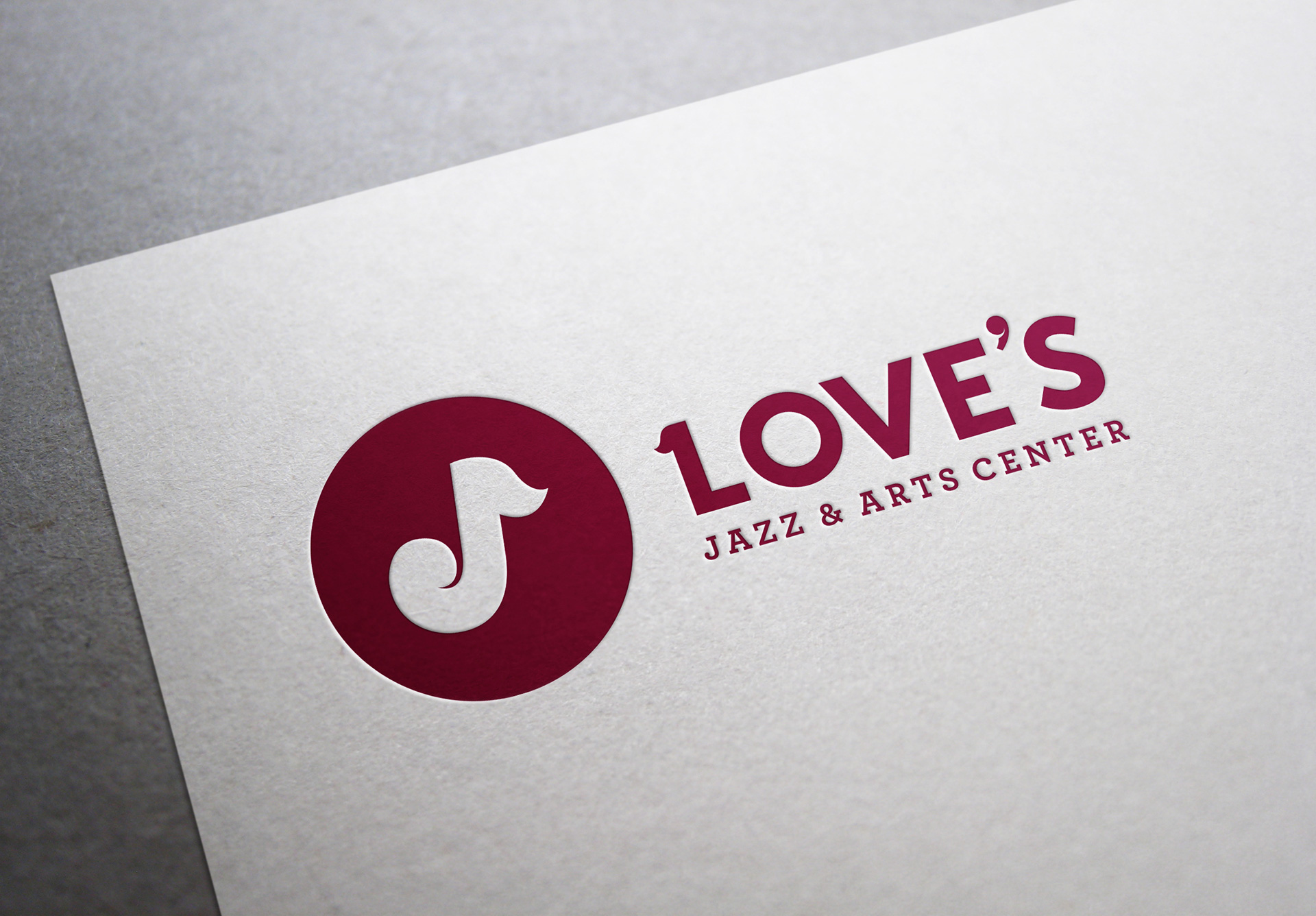
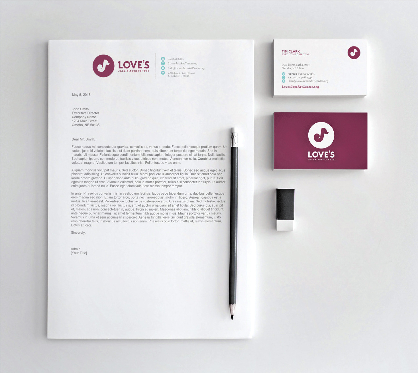
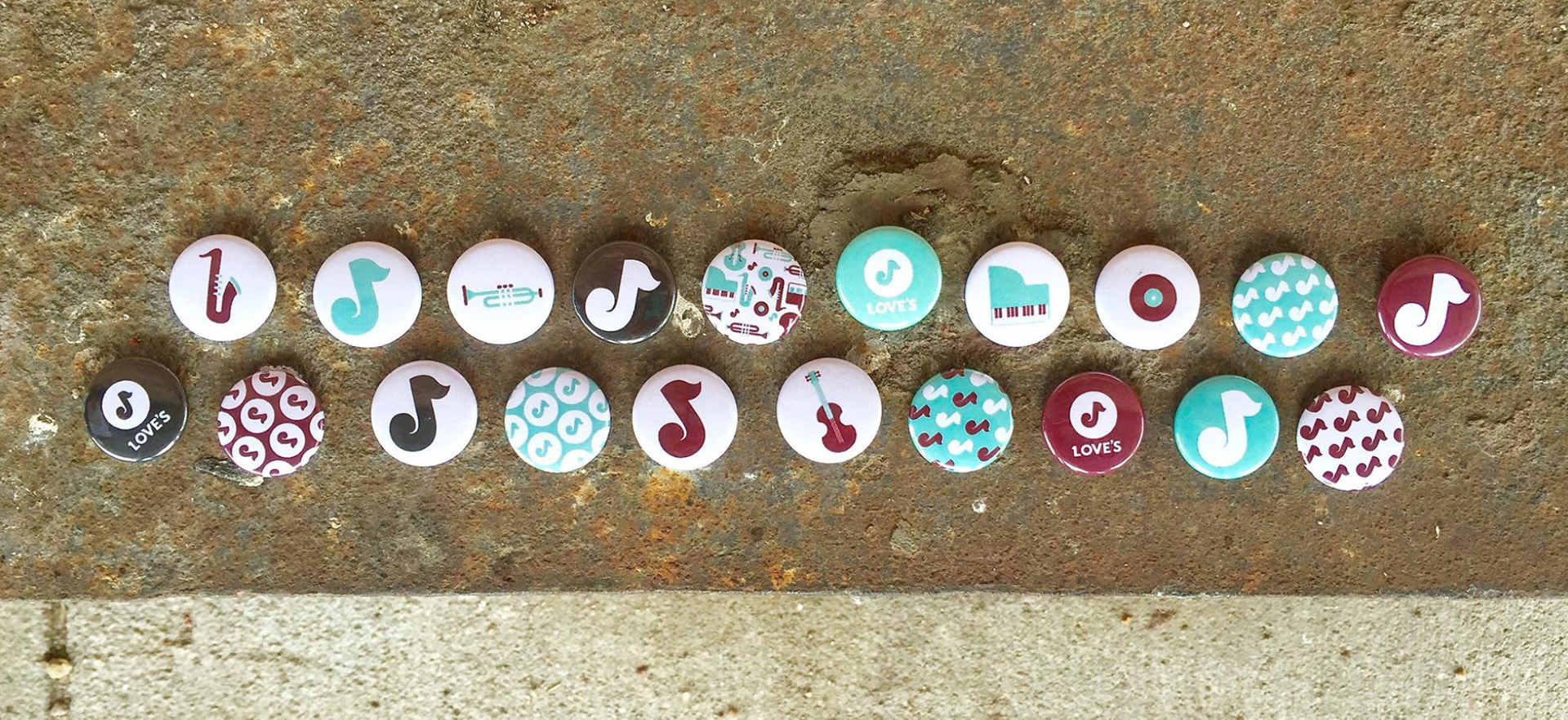
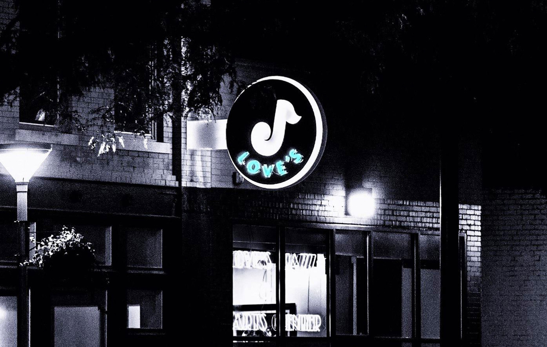
Celebrating it’s 10th anniversary, Love’s Jazz & Arts Center needed a refresh. Developed as part of an entire campaign to increase awareness and familiarity among the broader community population, the new logo is clean, simple, modern and expressive. With an energetic color palette, the brand identity – with the iconic use of the J as a musical note – provides the flexibility to work across multiple applications, including posters, brochures, post cards, signage, website and much more.
The Great Excheeriment
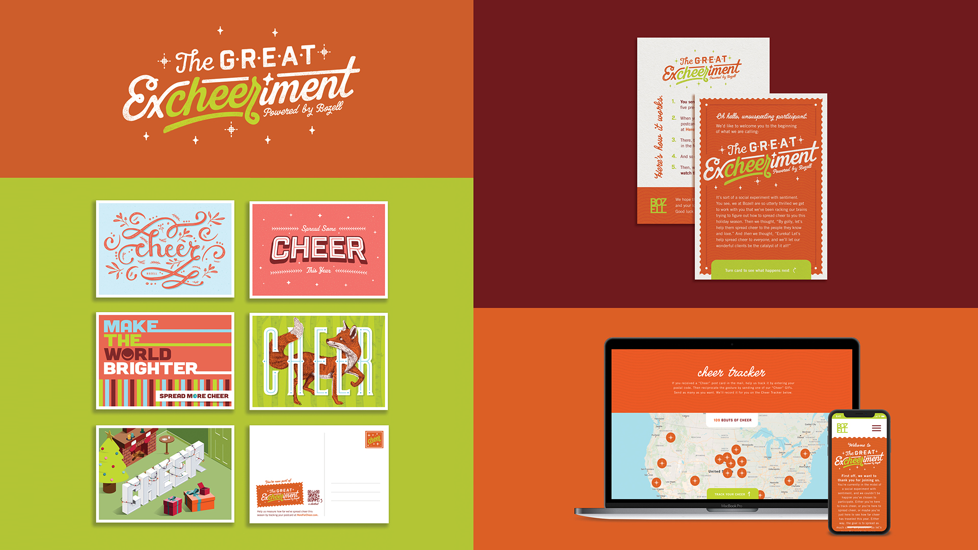
For the 2019 holiday season, Bozell launched “The Great Excheeriment,” a social experiment with sentiment. To spread cheer to our clients and friends – and multiply the holiday spirit – we sent each person on our mailing list five pre-stamped Cheer postcards, as well as instructions on how to participate in the excheeriment. They were encouraged to spread cheer by mailing the postcards to their friends, colleagues and loved ones. Upon receiving the postcards, the recipients are prompted to visit HereForCheer.com where they can track their locations. Those locations are instantly added to the Cheer Tracker map to visually record just how far and how often cheer has been spread. After tracking their cheer, visitors are then prompted to forward along Cheer GIFs – animated versions of the postcards – in order to continue spreading cheer this year. Then we’ll all sit back and watch how far the cheer spreads.
Conservation Series Zipline Bottles
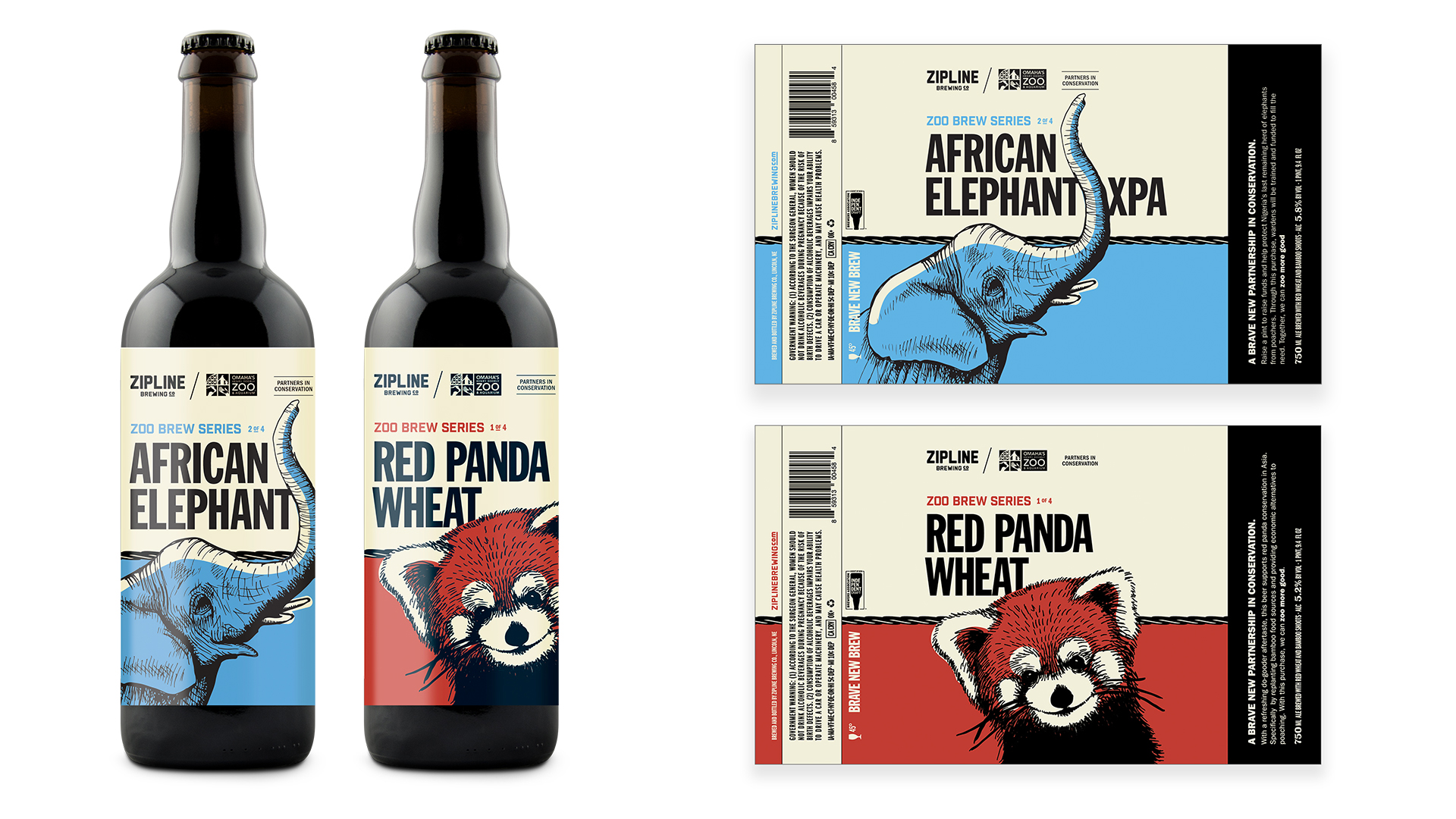
Conservation is a large part of Omaha’s Henry Doorly Zoo & Aquarium’s mission. In an effort to spread the word, as well as raise funds to help endangered animals, the Zoo partnered with Zipline Brewing Company to create a limited-edition series of original brews. Each bottle/brew dotes a hand drawing of an endangered animal that has a safe home right here in Omaha.
Omaha Street Car – Magic City Microsite
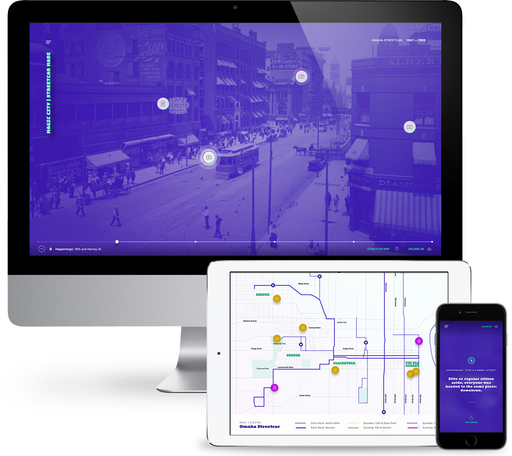
Early on, Omaha was nicknamed “The Magic City.” They had it all; they were growing fast. And the streetcar was at the heart of everything, transporting people from neighborhood to neighborhood and to businesses, hotspots and landmarks. To bring “The Magic City” back to life, this interactive website takes the visitor on a narrated trip down memory “line.” You can flip through old photos and meet famous (and infamous) Omaha celebrities. And, of course, you can choose to stop and learn more along the way or just keep riding the line to the end.
Meet the Pros
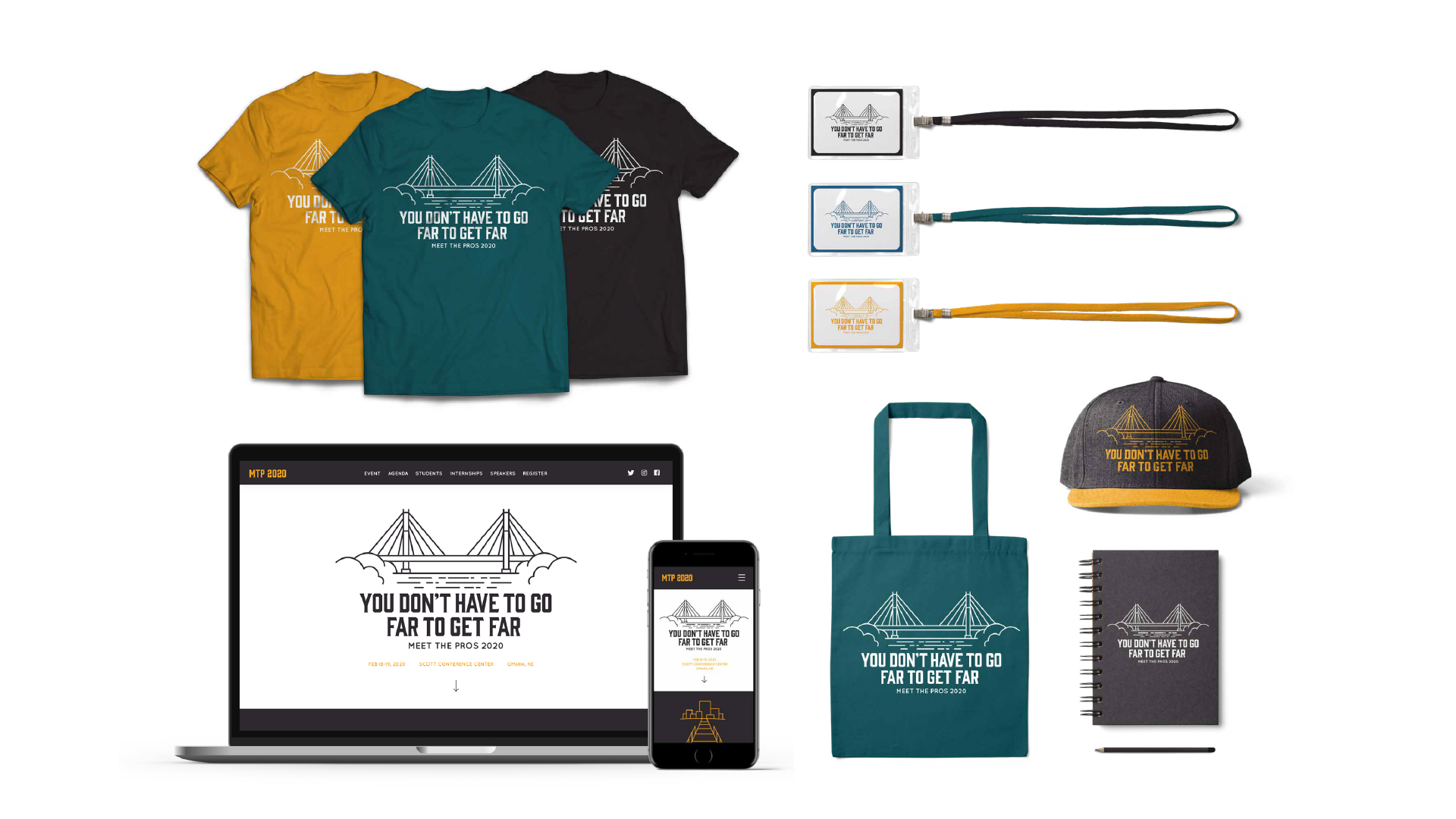
For 57 years, the American Advertising Federation of Omaha (AAF Omaha) has been presenting Meet the Pros – a 57-year-old advertising conference for college students. We tasked our 2019 summer internship team with creating the theme, look, social media plan and website for the 2020 conference. They already knew the audience well – fellow advertising, marketing, design, journalism and PR students. So they got to work brainstorming. After discussing several reasons why students would want to attend the conference, they landed on the theme “You don’t have to go far to get far.” They explored visual adaptations of the theme and researched design trends among this audience, before landing on this friendly and welcoming illustration of the Bob Kerrey Pedestrian Bridge. They presented the concepts to the client and received unanimous approvals. The team then finalized artwork, designed and developed the website, and connected and wrote a social plan for promoting the event. In all, it was an incredible learning opportunity for our interns and the client was thrilled with the work.
