A New Look for the Original Hot Dog
Long before Nathan ever arrived on the scene, Charles Feltman introduced the world’s first hot dog to Coney Island beachgoers during the summer of 1867. (In fact, Nathan was an employee of Charles Feltman). Nearly 150 years later, two brothers from Coney Island, Michael & Joe Quinn (Captain, U.S. Army) revived Charles Feltman’s legacy – and his original old-world recipe – to honor their late brother Jimmy who was killed in 9/11. And thus, the original original hot dog was reborn.
As a veteran-owned business, now the fastest growing hot dog company in the U.S., Feltman’s planned a Veterans Day Weekend giveback initiative to donate 100% of their website sales proceeds to The Headstrong Project—a nonprofit dedicated to supporting the mental health of veterans. To help prepare their website for an influx of traffic from these efforts, we were tasked with overhauling the site and its direct-to-consumer online store. The end goal was to boost the website’s ease of use and, ultimately, conversion rates.
Insights
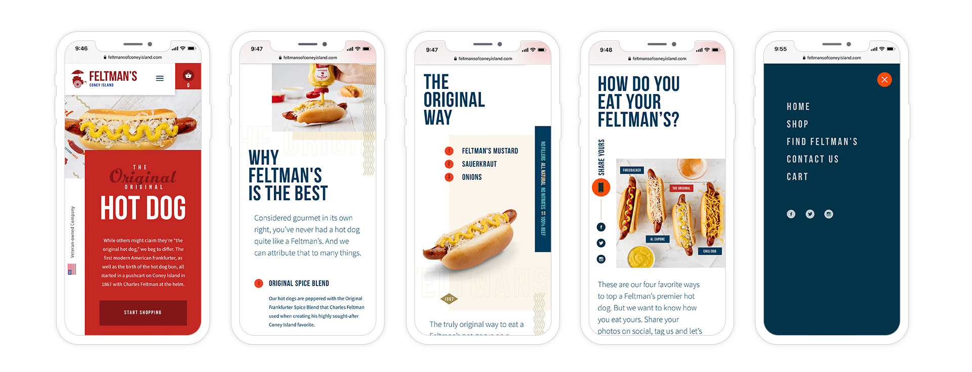
In order to gain a full understanding of the user’s journey and experience, we began our approach with a focus on discovery and planning. During this phase, we recognized that the e-commerce portion of the website (both on desktop and mobile) was confusing for the user – from understanding product details/quantities to being told when and how a shipment would arrive. All of these unanswered questions and more were halting conversion and causing Feltman’s to lose potential customers. Also, there was little in the way of enhancing the true gourmet experience of dining on a Feltman’s hot dog, and we knew we needed a complete brand refresh that would help better sell the product.

Execution
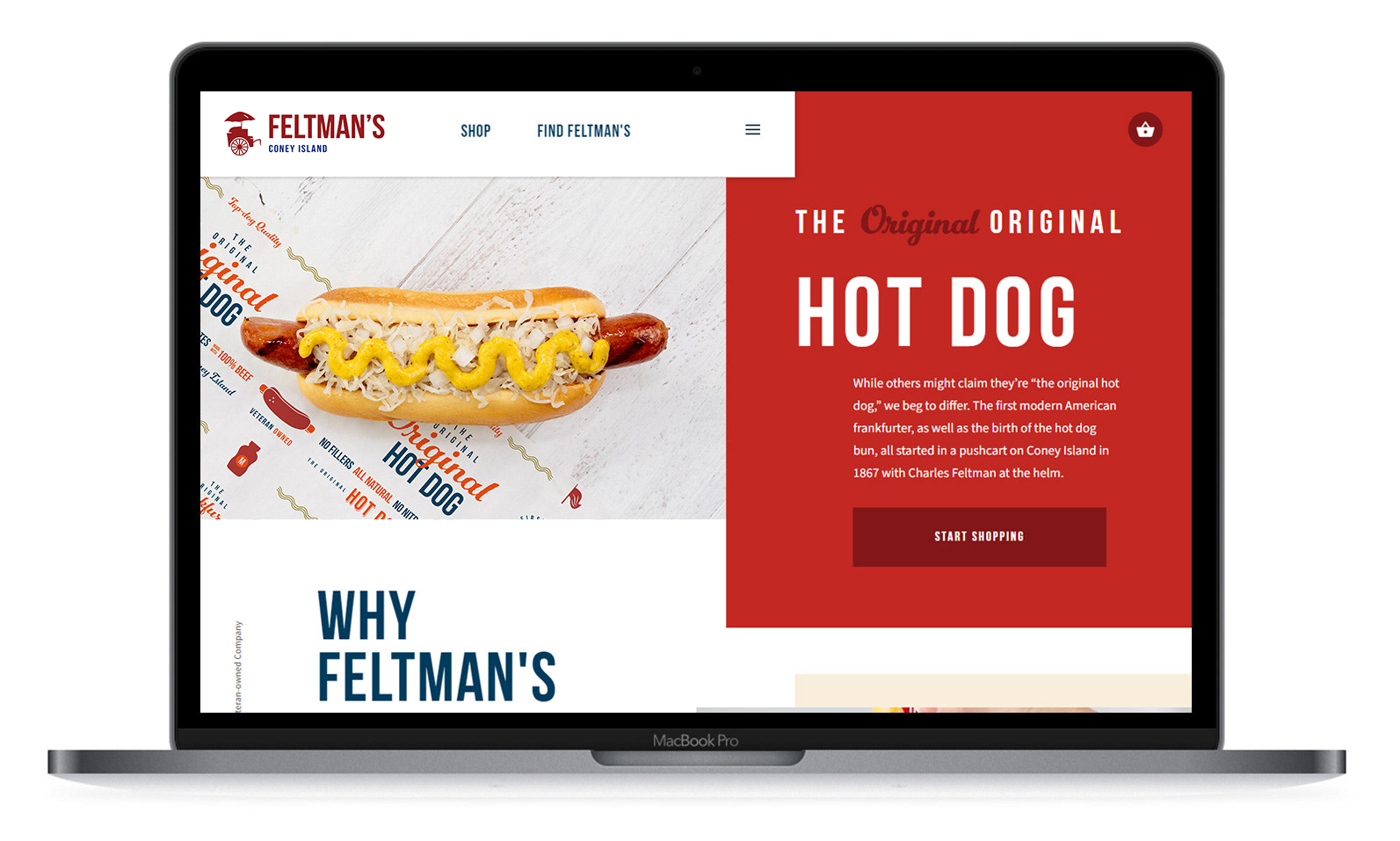
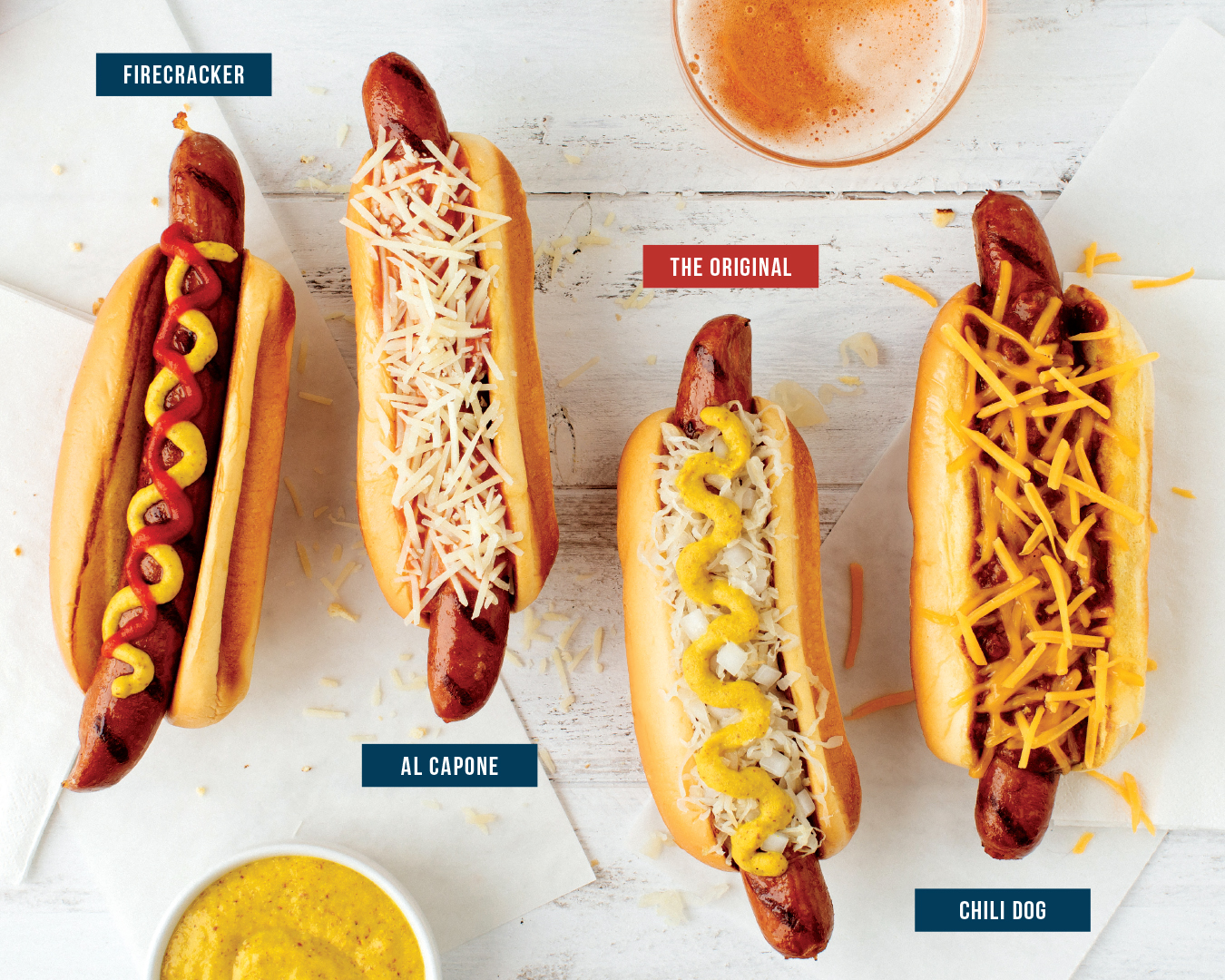
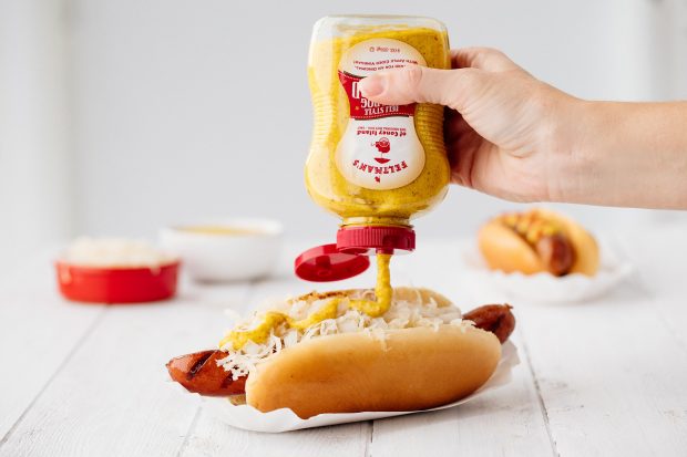
For look and feel of both the brand and website, we used a combination of nostalgia (the 150-year history) and fun (the Coney Island aspect). And because most people buy with their eyes, we focused on visual storytelling to make the overall experience richer and more compelling. We incorporated custom photography of the hot dogs, and we made the features and quality of the hot dogs more prominent. This allowed us to better appeal to the foody audience – the people who will pay more for a quality product. We also incorporated the history behind the famous frankfurter throughout the website, as well. All of this together helped drive the user further down the homepage and further into the website, making them more compelled to purchase.

Based on our UX audit of the current site, we streamlined the e-commerce buying process by reorganizing the Feltman’s products. We made it very clear what product you were purchasing and how many you were getting, as well as when and how the shipment would arrive. And we made sure the buying experience was just as streamlined on a mobile device as it was on desktop.

Results
With the giveback efforts and brand and website refresh in place, Feltman’s saw an e-commerce sales spike of more than $21,000 in just the first week after re-launch. In addition to that:
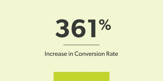
- Customer conversion rate jumped to 2.35% (up from 0.51%).
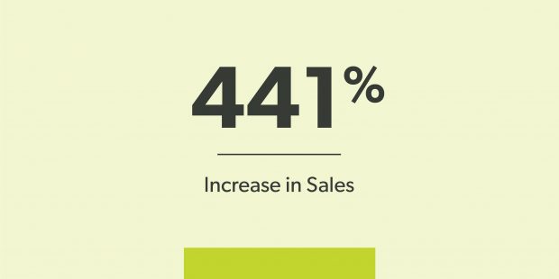
- They saw a 441% increase in sales overall.
- Bounce rates reduced from 79.2% to 30.9%.
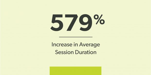
- Average session duration improved from :34 to 2:32 (a 579% increase).
- And pages per session improved from 1.58 to 3.16 (a 100% increase).
