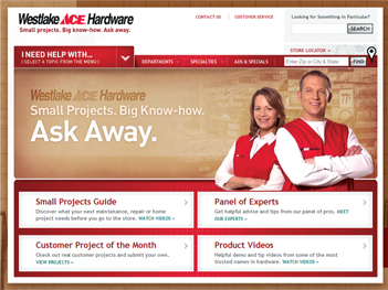
For more than 100 years, Westlake Ace Hardware has been the helpful neighborhood hardware store with locations throughout the Midwest. The largest Ace-affiliated family of hardware stores in the country turned to Bozell for a website redesign.
STRATEGY
 Initial research for the project told us the target audience was looking for ads, specials, store location information and other similarly “functional” features. But to stand out in a crowded market, Westlake needed its website to be truly distinctive. The functional aspects of the website were the easy parts to take care of. The challenge was in creating something of value to the customer that reflected Westlake’s unique strengths over its competitors.
CONTENT
 Westlake built its reputation on having qualified associates who can give knowledgeable advice regarding home maintenance and repair projects. This experience was translated into the new website. Keeping with the spirit of a consumer’s in-store experience, there is a remarkable amount of content and assistance is always a click away.
- On the homepage, the visitor is greeted by the site hosts, who introduce the site and are represented throughout the site so that there is always a “person” ready to assist you.
- A series of videos were produced to answer frequently asked questions. Each video links to written step-by-step instructions.
- In another video series, panel of practicing professionals from trades including plumbing, horticulture and painting take an in-depth look at common problems. They will contribute answers to customer questions on an ongoing basis.
- More than 200 product videos feature information about Westlake products. Some videos were produced specifically for Westlake and give the visitor details about items that would be hard to get otherwise.
- We also collected more than 600 text FAQs within the site. The FAQs are searchable and cross-referenced with all the other types of content so that anywhere a visitor goes on the website, help is at hand.
- The “Project of the Month” contest allows customers to enter their own small projects for the chance to win a $300 gift card and have their project featured on the website.
Of course, there are all of the other parts of a regional retailer’s website that you’d expect to see, too—company information, sales and specials, a robust store locator and much more. And it’s all delivered in a way that makes finding things as easy as possible.
EXECUTION
 The site was built upon an industry standard content management system that allows for rapid updates, easy additions and back-end customization. A special navigation menu was designed to incorporate all of the various help topics under one primary “I Need Help With” menu. This way, visitors can browse the categorized help content and see all of the videos and text answers in context of their particular question.
The new site incorporates SEO best practices and is geared toward both humans and search engines being able to find things easily. Attention to SEO was critical—the new site has over 1,800 pages of indexed content. The old site had 120.
We’ve also integrated detailed analytics to measure the popularity and effectiveness of virtually every aspect of the site. Through customized dashboards, essential information is available at a glance and automatically delivered to key team members. We provide deeper analysis of the reporting and strategic recommendations based on insights gleaned from customer behavior on the sites and in the stores.
The ongoing marketing plan incorporates regular content updates and communications through the website and social media channels. This emphasizes the continuous relationship that Westlake has with its customers. There are always more questions about projects, and Westlake will be there to provide answers.
CONCLUSION
 The new site is fresh, unique and filled with great resources for Westlake’s customers. It further establishes Westlake as the neighborhood hardware store that you can count on for expert advice and help whenever you need it.


2 Comments