“Flatten the curve.” Thanks (or no thanks) to COVID-19, this phrase has become part of our daily vocabulary. It’s everywhere: in headline news, on social media, and chats between co-workers and friends. Just one month ago, we hadn’t even heard of it, even though this debilitating disease was sweeping through Asia.
Fast forward to today and we are in the midst of a global pandemic. For me, it feels unworldly. It’s like we’re trapped in an apocalyptic sci-fi movie except there’s no Brad Pitt in sight to save us. It’s overwhelming and brings on that sense of helplessness when we feel that there’s nothing we can do.
But for the past two weeks, the World Health Organization (WHO), along with federal, state and local governments and medical practitioners have been preaching “flatten the curve” in order to not overwhelm our hospitals with sick patients.
Great! We can do something! But what exactly does flatten the curve mean? We’ve already started to panic about every single cough we hear. We’re not listening or reading (social media) in a rational manner. WHERE IS OUR BRAD PITT?
Well, this animated graphic doesn’t have a full head of blond, wavy hair, but it’s as close to Brad Pitt as we can get right now.
Our #FlattenTheCurve graphic is now up on @Wikipedia with proper attribution & a CC-BY-SA licence. Please share far & wide and translate it into any language you can! Details in the thread below. #Covid_19 #COVID2019 #COVID19 #coronavirus Thanks to @XTOTL & @TheSpinoffTV pic.twitter.com/BQop7yWu1Q
— Dr Siouxsie Wiles (@SiouxsieW) March 10, 2020
We watch the animation for a few seconds, and we get it. Staying away from people = slowing down this virus, which lessens the burden on our healthcare system. Visually, I can see it happen and it makes sense.
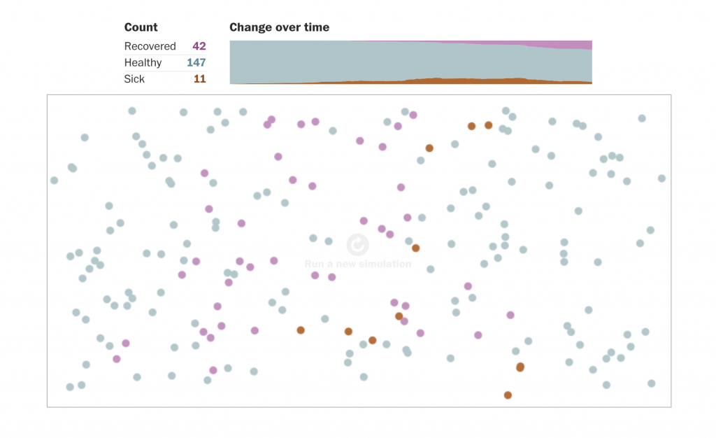
Other graphics (like this one from the Washington Post) soon followed that helped visually explain how staying home helps lessen the chance of infection.
I believe these visual interpretations were a game-changer for people to understand why it is important to practice social distancing and to stay home as much as possible. It might be weeks or months before we know if we did our best to flatten the curve but these images hopefully convinced people to isolate and remain as healthy as possible.
Like I’ve always said, design isn’t brain surgery but, maybe, just maybe, it will save some lives.
Interesting footnote: The flatten the curve graphic was originally developed in 2007 by New Zealand microbiologist Siouxsie Wiles and drawn by illustrator Toby Morris. (Source) But you probably saw it first on March 8. Since then, it has 4.5 million impressions on Twitter. (Good job, Twitter people).


One Comment