Three goals. One user-friendly site.
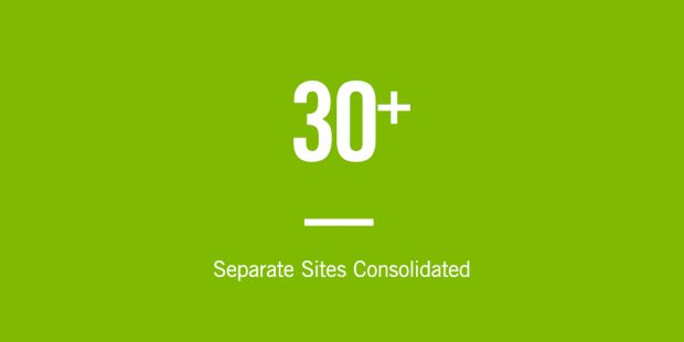
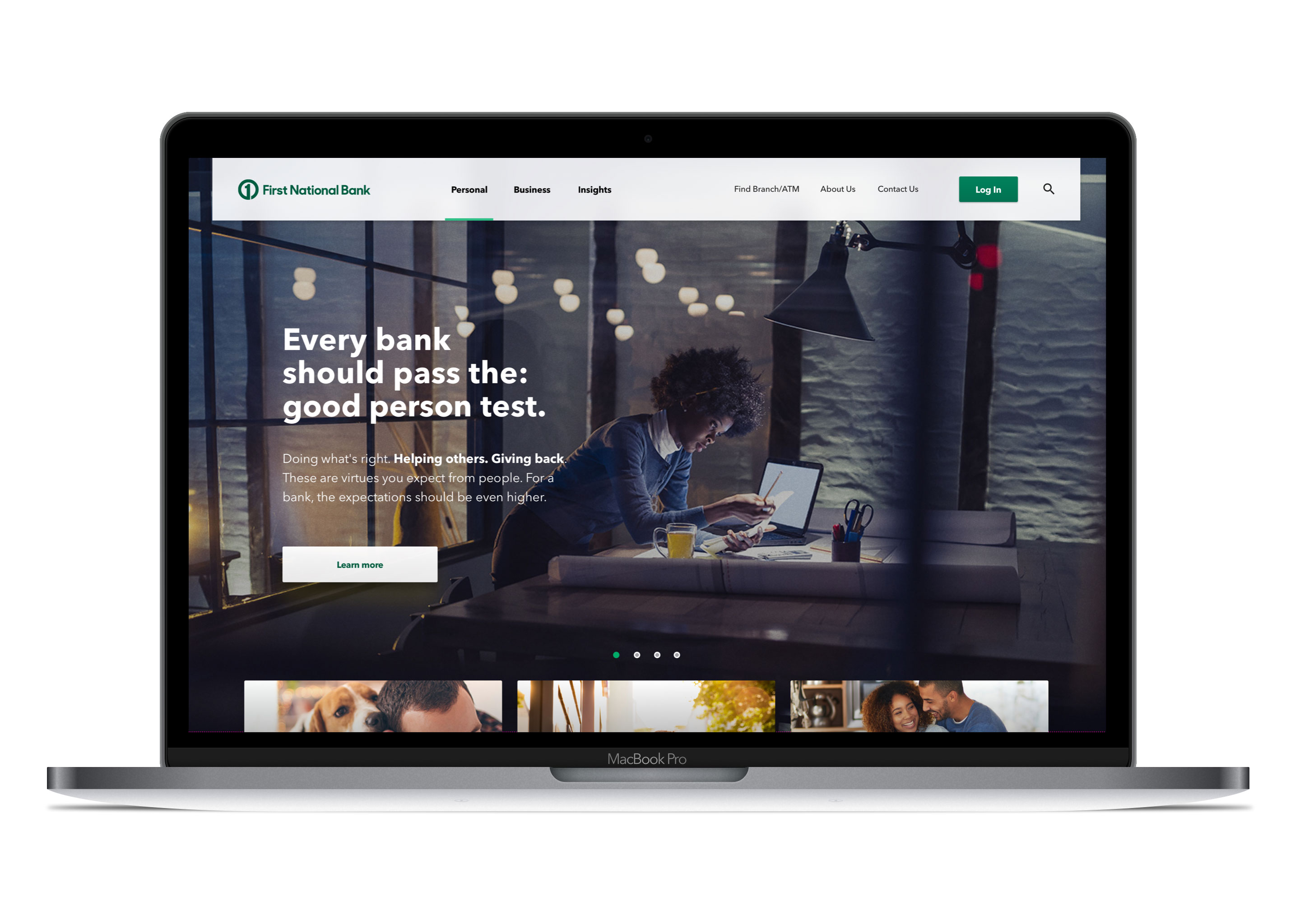
First National Bank of Omaha’s (FNBO) web presence was fragmented, with multiple sites for different market regions, and content was organized by product and company infrastructure – not necessarily how consumers needed the information. So we helped them design and build a website that not only consolidated their content and approach into one enterprise-wide site, but that also united customer value and business purpose to help customers along their banking journey. The website, like their business, needed to show consumers they come first.
Insights
After much planning, collaboration and research, the goals for the site became:
1) Deliver a mix between design and function, while also working within the ADA guidelines.
2) Utilize information about how and why customers are accessing the site in a way that makes the site as user-friendly as possible.
3) Identify what consumers and users need at different points of their discovery/purchase process and pair that with the products and services the bank provides.
Execution
Our mobile-first design focused on value to user and utility, zeroing in on helping people gather information, rather than hunt for it. We challenged FNBO to position themselves as thought leaders and provide expert advice through their existing blog content, calculators and tools – all things that would allow the user to feel more confident in their decisions and build a stronger relationship with the bank.
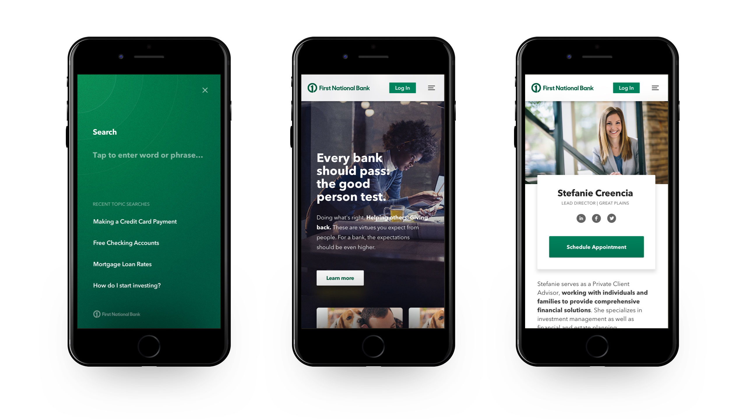
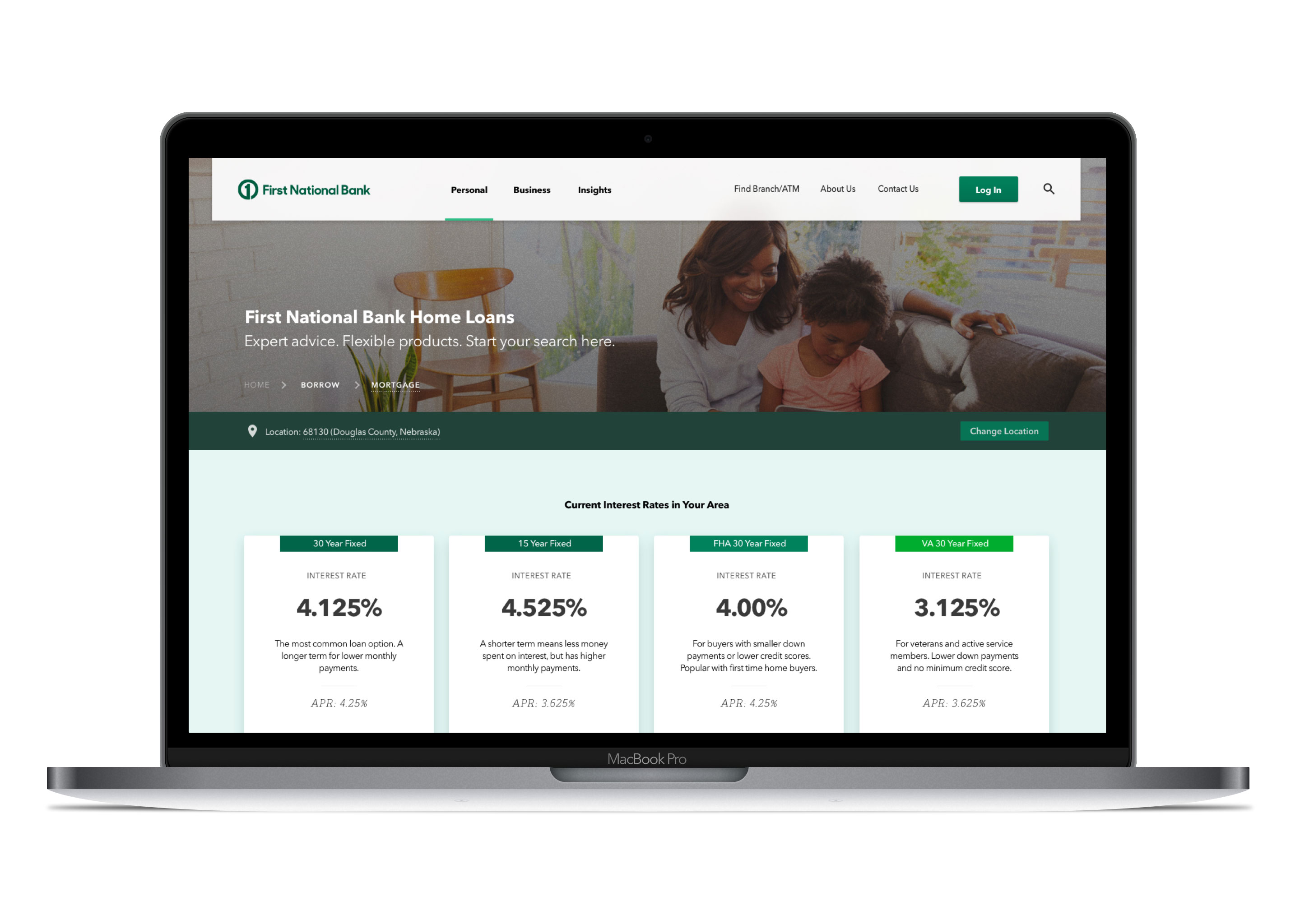
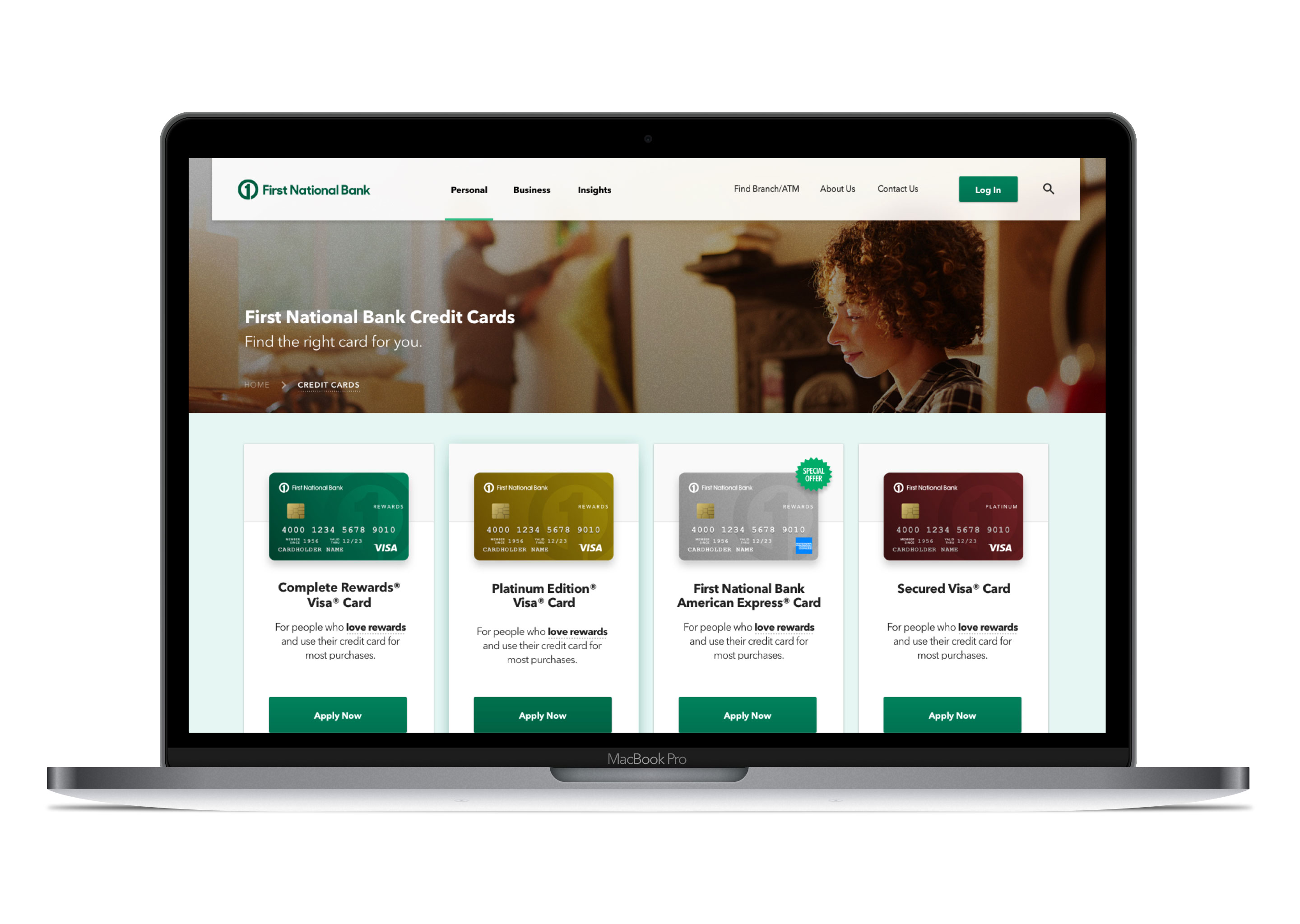
To do this, we identified, organized and re-packaged most of the existing content in a way that was not only more visually appealing but easier to digest than the previous layout. This allowed FNBO to really focus on which products to showcase and how and where they needed to be located in the site structure.
We also developed a structure of content sampling that would allow FNBO to showcase any new marketing, brand, product and industry content with ease, and allow the user to digest at their own pace without overwhelming them with stimuli.
Because we identified that many of the visitors coming to the site were simply there to log in, we put the login section in a more prominent location. This allowed us to get those customers where they were going faster, better meeting their needs. Our new design also allows visitors to access this function from every page on the site via desktop and mobile.
Results
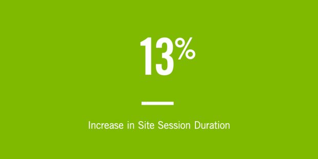
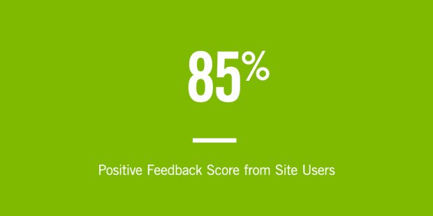
Over the course of the launch and in the following months, time spent on the FNBO site increased in all durations. Most notably were the one-to-five-minute and 10-to-30-minute categories, with a combined increase of almost 13%. A post-overhaul survey also revealed an 85% positive feedback score from site users.
