
What I Learned from 1996’s Bozell.com
Back in the day, entire banner ads had to be kept under 40kb, auto-playing background music was all the rage (did you know I had a Geocities site dedicated to techno MIDIs?), Altavista was my search engine of choice, and websites were built as tables – well, kind of. I still remember proudly presenting the first website I coded as an interactive developer, only to be told about these new things called cascading style sheets.
As our agency’s third core tenet prominently states: “Embrace change – become fluent in the latest and greatest, and then get ready to move on because the astonishing statistic of today has a replacement on the horizon.” Nowhere does that tenet seem more relevant than the world of UI/UX.
As we began the planning process for our agency’s 100th anniversary, the data-hungry analytic in me manifested itself as I sought to absorb every ounce of Bozell history possible. One such nostalgia-inducing morsel required taking a trip in the Wayback Machine—a site that allows you to see what sites looked like during a specific year—all the way back to 1996. While young Dan Cooper was just setting foot in the terrifying world of middle school, Bozell was busy building, updating and maintaining its 640-pixel-wide, Netscape Navigator-optimized agency website, Bozell.com. In between efforts to develop the technology that would ultimately turn into DoubleClick, Bozell was surfing its 56kbps connection in style with compelling case studies, blog posts (before they were cool), and an easy-to-navigate user experience that favored function over form.

You see, while your web browser may have changed, your usernames matured, and your internet connection inoculated against phone calls, the basics of user experience have not. No amount of JavaScript, Flash or HTML5 can change the need to focus on the user, ensuring everything they need is within reach, easy to use and compelling.
Comparing a 25-year-old website to today’s best practices is bound to make any agency alum squirm a bit in their seats. But, for this article, I found this comparison to be far more enlightening than frightening.
Here are three things I learned:
- Skeuomorphism isn’t always bad.
In the early days of the Internet (when the debate over what “@” meant was actually a thing), people needed help understanding how to navigate the web. One common solution was skeuomorphism, or, put more simply, using a graphical user interface that mimicked elements’ real-world counterparts to aid in comprehension. The Bozell.com homepage from 1996 was designed to look like an open portfolio briefcase, recreating a similar experience as a live, face-to-face meeting in a board room. The familiar scenario set the tone and helped weary CMOs navigate the site with ease.When Apple simplified its approach to home-screen icons with iOS 7 in 2013, many analysts proclaimed the death of skeuomorphism. But, as witnessed with Google’s recent attempt to brand its icons more cohesively, the use of unique graphics to represent some facet of their real-world counterparts, however abstract they may now be, is still one of the best ways to enhance and improve a user’s experience. - Surprises still delight.
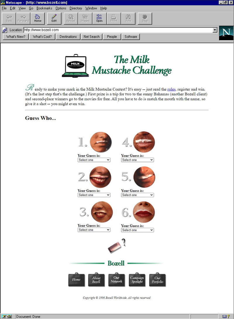
Imagine my surprise when I landed upon a six-question mini “Milk Mustache” quiz on a 25-year-old site. Had I inadvertently switched over to an open Buzzfeed tab? Why was there something so seemingly entertaining on an otherwise corporate website? Who the heck is Steve Young?I’d venture to guess it was because whoever designed the site knew that little surprises can lead to big delight. The designer could easily have just added a callout saying “WE DID THE MILK MUSTACHE CAMPAIGN.” But, instead, they put in a little extra work to add something that did much more than convey our role in the iconic campaign – it helped the user experience the campaign.
Whether it’s a randomly placed quiz or a well-hidden Easter egg, adding a bit of nuanced surprise to your site is one of the best ways to stay memorable and attract engagement.
- Understanding your audience has always been important.
Another of Bozell’s core tenets states the importance of staying close to the customer. Though we have tools that 25-years-ago Bozellers could never probably have imagined (might we tempt you into trying 360 Listening?), understanding the customer, their needs, and what “success” ultimately looks like are concepts 100 years in the making.In 1996, simply having a website with current content may have been enough to convey credibility. But more than that, it was easy to use, loaded quickly, and proved informative and entertaining. In 2021, when even pets have their own websites, understanding the customer through user-journey mapping, focus groups, interviewing and analytics is more imperative than ever. It ensures the site will not only be close to the customer, it will also be informed by the customer. And who wouldn’t want to browse a website built with them in mind?
As I navigated the relic that was 1996’s Bozell.com, I found myself clicking around with a smile on my face. Reading an opinion piece on the internet’s marketing future, written by Dave Carlick, general manager of Bozell’s then internet-focused sub-agency, Poppe Tyson, proved both scarily accurate and reassuringly untrue. But it was the easy-to-understand UI, the tucked-away surprises, and the clear understanding of the intended audience that really left a lasting impression. While many things have changed since the days of “You’ve got mail,” it’s nice to know that some principles have, and will probably always, stand the test of time.
Just not coding in tables.

