Mobile first has gone from popular buzzword to crucial business strategy as Google updates its algorithm to increase rankings for mobile-friendly sites.
Starting April 21, Google’s changes could have significant impact on your mobile search rankings. If your site is mobile-friendly, expect to see an improvement. Sites that aren’t mobile-friendly will see a drop.
Because Google knows that redesigning a site will take a larger budget than most companies have, they are willing to accept page-by-page fixes. So for now, Google is ranking pages on a page-by-page basis rather than site-wide, and it’s doing its part to improve the mobile experience by rewarding the best pages in search results.
So what does this change mean for you exactly? In short, if your website is not mobile-friendly, meaning your site is not responsive to different screen sizes, properly configured and able to be viewed on multiple device types, your site could be penalized in search rankings. All the valuable SEO your site has currently could be for naught if your site isn’t viewable on a mobile device.
Why is this happening now?
The reasoning for this update is simple. 2014 was a tipping point in that over half of web traffic in the US now occurs on mobile devices. As the world moves to mobile and more and more of our lives occur in a handheld device, it is critical that websites are able to keep up. By rewarding those sites which are mobile friendly, Google is continuing to shape the digital landscape.
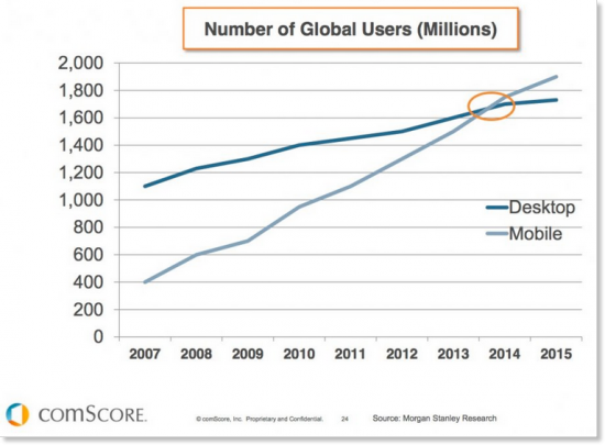
More people are consuming content through 4.5-inch screens rather than 15+ inch monitors, a major shift that will gain speed in coming years. As big as it is now, the mobile revolution is still ahead of us.
What Are We Doing on Mobile?
How do consumers use mobile devices to access the Web? According to Online Publishers Association/Frank N. Magid Associates:
- 99.5 percent access content/information
- 63.1 access the Internet
- 62.1 percent check email
- 49.2 percent listen to music
- 46 percent play games
- 41.7 percent download and use apps
- 15 percent make purchases
- 15 percent read a book
Shift to Mobile Impacts B2B Significantly
If you imagine that the mobile usage is merely a reflection of consumers logging onto social media, checking email or conducting search, or shopping, think again.
According to Seo toronto agency, executives lead the way in mobile adoption, validating the theory that digital assets for a business or brand must serve target audiences 24/7, and not just during business hours. Executives rely upon mobile devices (tablets and smartphones) to conduct business research more frequently in the evenings than any other time of day.
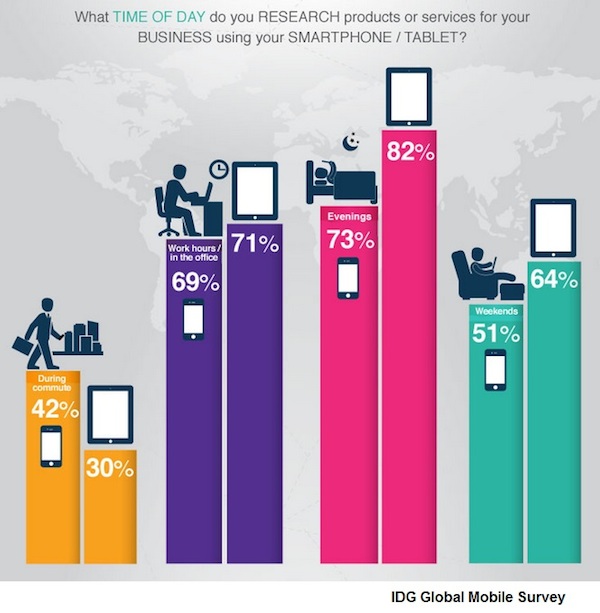
B2B Decision-Makers Rely on Mobile Devices
Mobile is preferred over the PC for executives conducting research during and after office hours, according to the IDG Global Mobile Survey 2014.
- 92 percent of executives own a smartphone used for business.
- 77 percent of executives use their smartphone to research a product or service for their business.
- 93 percent of executives will purchase that product via the Internet using a laptop or desktop.
- 86 percent use their tablet and 72 percent of executives use their smartphone to conduct research for products or services for their business.

How Do You Know If Your Site Is Mobile Friendly?
Before you fret too much, you need to determine whether your site is at risk. To determine whether your website is currently being deemed “mobile friendly” by Google, there are two simple tests to run.
 1. Check your site’s SERP appearances in a mobile browser. You may have already noticed that mobile-friendly tags are included in certain search results within Google searches on mobile devices. If your site shows up there, your site is already mobile friendly and you don’t have anything to worry about.
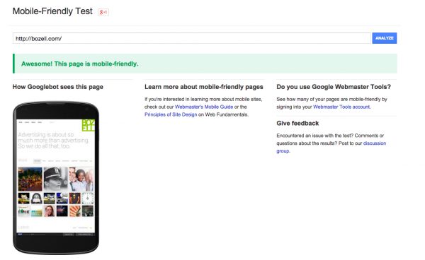
2. Run your site through Google’s Mobile-Friendly Test. Simply enter your URL into the grader. You can also check the Mobile Usability Report within your Google Webmaster Tools account for additional details on mobile compatibility issues across your site.
 Google provides a 60+ page guide that discusses why and how to build a mobile-friendly website. There are dedicated guides for several open-source CMS platforms (WordPress, Drupal, Joomla, etc.), as well as a specific guide to mobile SEO, with special emphasis on avoiding common mistakes.
If you need help, give us a call.

