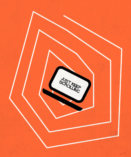
 Above the fold: a term adopted for the web from the convention of positioning the most important information on the front page above the fold of a newspaper. In the context of the web, above the fold refers to the visible portion of a webpage before scrolling. Using the above-the-fold strategy of content organization made sense when computer monitors shared similar screen sizes, but in today’s technology-driven culture, designing above the fold for a shared screen size is impossible. Consumers of the internet have opportunities to visit websites on desktop computers, laptops, tablets, phablets and phones.
With the differences in screen size and resolution, the above-the-fold strategy should be reconsidered. Content organization should not be limited to trying to squeeze content into a viewable portion of a page that users naturally know how to interact with.
The UK digital user experience firm, cxpartners, conducted their own study to examine the above-the-fold myth. They used eye tracking to come to several conclusions about how people use websites. One conclusion they found was that one of the most often viewed parts of a webpage is the scroll bar. 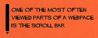 Users know that webpages scroll and expect that behavior when visiting a website. Another conclusion found was that having less content above the fold may drive page visitors to scroll and explore more content below the fold.
Tracking user experience and interaction isn’t just limited to studies by consulting firms. There are services like Lucky Orange that make these analytics available to you. It offers heatmapping, a visual representation that tracks clicks and cursor movement. By analyzing heatmaps of users visiting a site, you can find out what content is most important to users, and have insights into how those users digest the content.
Abandoning the above-the-fold mentality and actively monitoring how our websites are used, we are open to explore the freedom of space that the internet allows. Our sites aren’t limited by the physical boundaries of the newspaper page and we shouldn’t treat them as if they were. People know how to use webpages and we need to respond to that by introducing space and imagery in our content designs to deliver better organized content that is pleasing to digest.